
.webp)
Imagine a powerful enterprise platform that has evolved functionally for years, earning the trust of giants like Disney, PepsiCo, and the European Parliament. As the product reached incredible levels of complexity, a moment arrived when the focus shifted from "what it can do" to "how easy it is to do it." This is the story of our collaboration with one of the leading platforms for managing corporate communications.
We’ll share how we transitioned from a classic, overloaded interface to a system where onboarding time for new users dropped from six months to just 90 days. This is a story about how a deep dive into human needs and bold design decisions breathed new life into a complex but mission-critical tool.
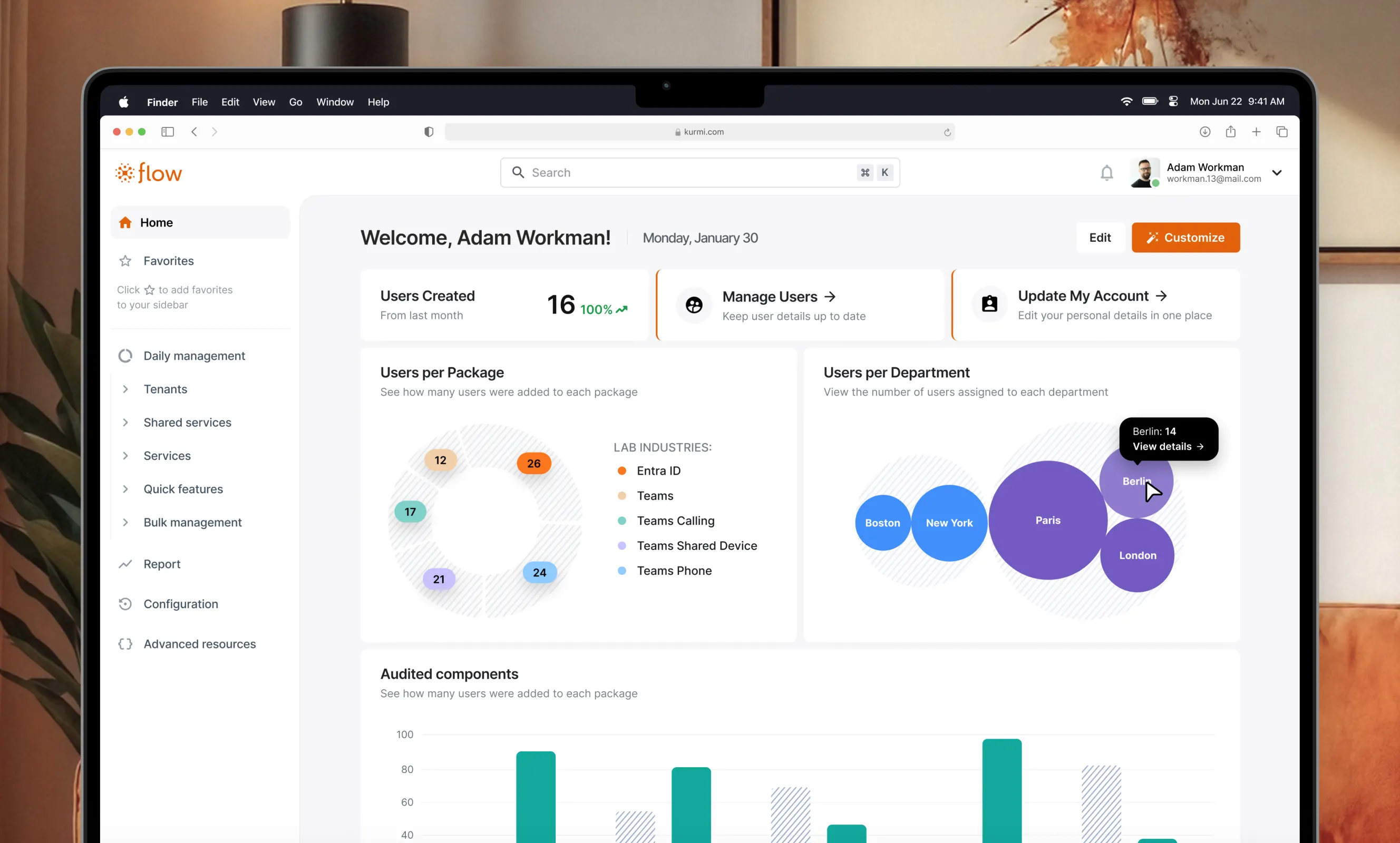
This B2B SaaS platform is a true command center for IT administrators. Through it, they manage thousands of corporate phone numbers, licenses, and settings. Despite an impressive client base, over the years, the product accumulated what is known in the industry as "design debt."
"The platform looked, let’s say, 'classic' for its segment. This was logical, as its development had been focused on engineering power for years. Design decisions were made at the level of product managers and developers who solved technical tasks brilliantly, but over time, the interface began to lag behind modern usability standards." – product designer at Linkup ST, Yaryna Oprysk.
The product grew more complex, and users were getting "stuck." Why are the forms so massive? Why does nothing happen after an action is taken? Where is the required function located? The platform team realized that further growth required change and turned to us.
The task was no small feat: redesign a product that could not be "paused" for even a minute. It was used daily by thousands of administrators, so every decision had to be careful – improving the experience without breaking it.
Before opening Figma, we started with conversations. We spoke with everyone: sales reps, the support team, managers, and – most importantly – the administrators who spend several hours a day in the system. These conversations gave us an understanding of their real pain points.
The main dashboard was overloaded with charts, diagrams, and widgets.
"At the very beginning, my task was to figure out how to show a huge volume of information so that it was easy to read, understandable, and, above all, useful. Not just random widgets scattered on a page, but something that truly works for the user," notes product designer Yaryna Oprysk.
We conducted a series of tests with real administrators to understand which information was key for them and what was merely visual noise. This helped clear the space and focus attention on what matters most.
The forms in the system were often gargantuan. During testing, we discovered an interesting insight based on two different scenarios:
The Solution? Instead of choosing one over the other, we gave users the ability to toggle the form view themselves in the settings.
In total, 132 people participated in our research. We utilized six different UX testing methods to ensure we were moving in the right direction.
Working on a product like this isn't just about drawing pretty pictures. We faced serious technical constraints that dictated the rules of the game.
"All elements in the design are 'shared.' For example, if I have a table, that table is displayed across all pages, even though those pages have different functionalities. If you change a component in one place, it updates everywhere. Consequently, you have to understand every possible scenario of how that component might function," explained product designer.
This meant every decision had to be tested against dozens of scenarios to ensure nothing broke in an unexpected place.
The development team needed time for optimization before they could implement new, more complex design solutions.
Despite this, we managed to implement several simple but powerful ideas:
We worked in small iterations. Every decision – whether a new page design or a functional update – was validated in workshops. These were attended by everyone: technical specialists, product managers, and administrators. This allowed us to consider all viewpoints and prepare for the big release, step by step.
It’s also worth mentioning the tools. Modern technology significantly accelerated our work.
"Recently, I started using Claude. AI helped me create a design system quickly and with high quality. For example, we had a light mode and needed a dark mode. Using Claude, I was able to quickly set up all the rules for how the themes should switch and create the corresponding components for the developers," commented product designer at Linkup ST.
Dark mode, by the way, was one of the top requests from users. Many of them are engineers accustomed to working with code in dark editors. For them, it’s not just aesthetics; it’s a familiar working environment that reduces eye strain.
The best illustration of this project’s success isn't the numbers in reports, but the real changes in the users' lives.
"Before our intervention, onboarding to teach a person how to interact with the platform took six months. Now, that process takes up to 90 days. It’s three times faster. This means we truly improved the overall UX."
The client's reaction after the release was definitive:
As a designer, it was important for me to make the system answer the user's questions itself – to eliminate misunderstandings and make everything clear. It took me six months myself to fully grasp how this product works. We did everything we could so that new users would never have to go through that long path again.
This project proved that even the most complex enterprise product can be made human and intuitive when design and development work side-by-side, focusing on the needs of the user.
..svg)

.svg)