
We kept having the same conversation with founders over and over. Someone would say: we need a full redesign. Three questions later, it was clear they actually needed a small refresh. Or the opposite — they wanted a small refresh, but their product had structural problems a fresh coat of paint would never fix. The gap between those two paths is not small. We are talking about the difference between a $200 weekend update and a $15,000+ multi-month engagement. Using the same word "redesign" for both is how teams end up in the wrong project, with the wrong scope, and the wrong expectations.
This article is based on a live webinar, "Redesign vs. Refresh: How to Make the Right Call Before Committing Budget," hosted by Linkup ST. It covers three real business cases, a four-level framework for understanding what kind of work your product actually needs, a practical decision tool, and a clear picture of what to measure before you commit a single dollar to design work.
By the end, you will have a structured way to turn the feeling that something needs to change into an informed decision about what, exactly, to do about it.
Before we talk about how to decide, let us look at what redesign and rebrand work can actually do — with real companies, real numbers, and one cautionary case that is worth understanding before you commit to anything.
To be clear: we are not against redesign. We are designers. But redesign should move numbers, reduce friction, and clarify positioning. It should not happen just because a product looks old or a competitor launched something new. The distinction matters enormously.
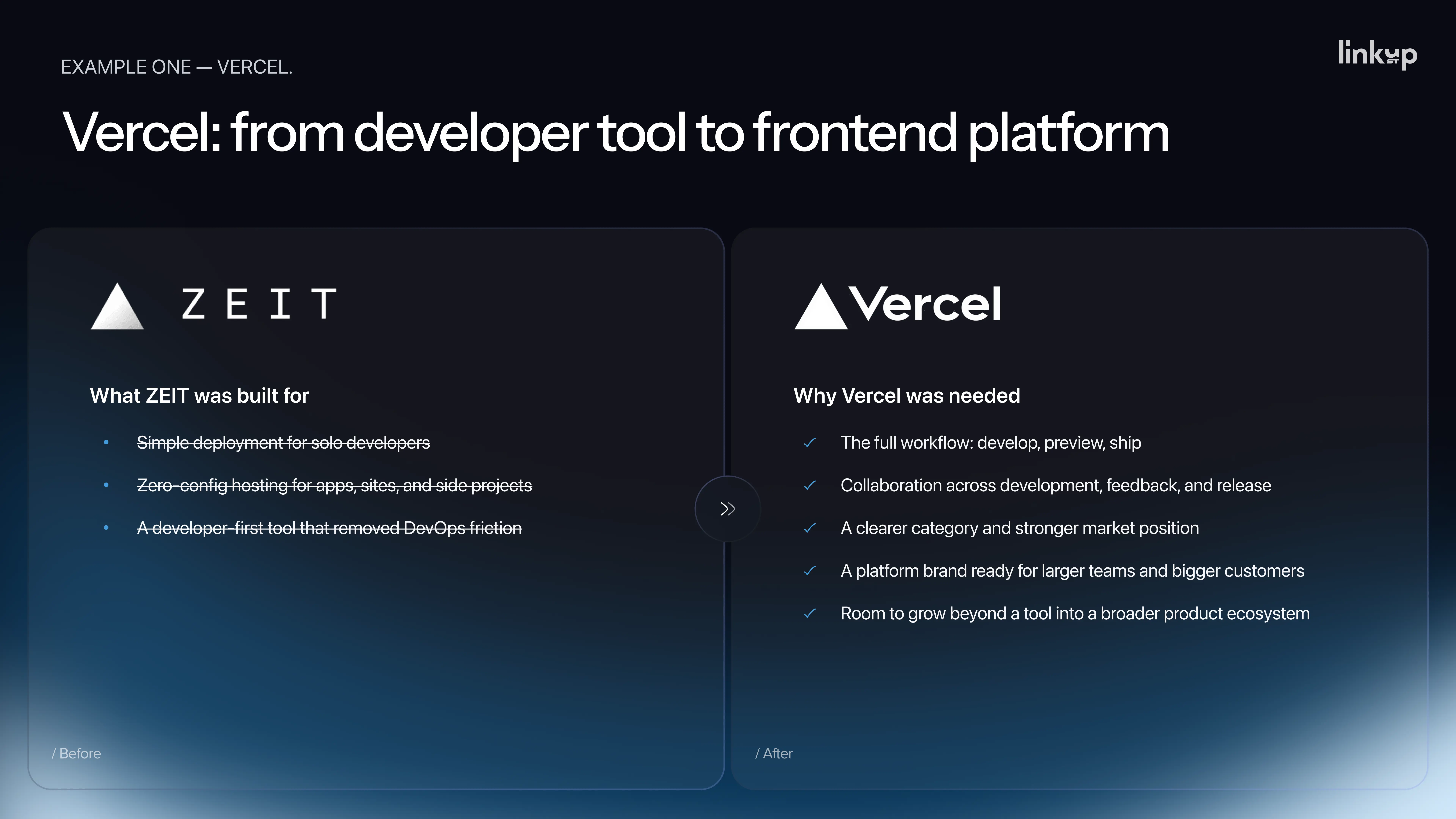
In 2020, the company then known as Zeit rebranded as Vercel. This was not a logo change. It was a new name, a clearer product category, and a repositioning around the frontend cloud and developer experience. At the time of the rebrand, the company had roughly $5 million in revenue.
By 2026, TechCrunch reported an annual recurring revenue run rate of $304 million.
The rebrand did not cause that growth alone — the product, Next.js adoption, and AI-driven development trends all contributed significantly. But the rebrand helped the company look and sound like the larger platform it was already becoming. That is the job of a well-timed brand change: removing a positioning ceiling before it becomes a ceiling you can feel.
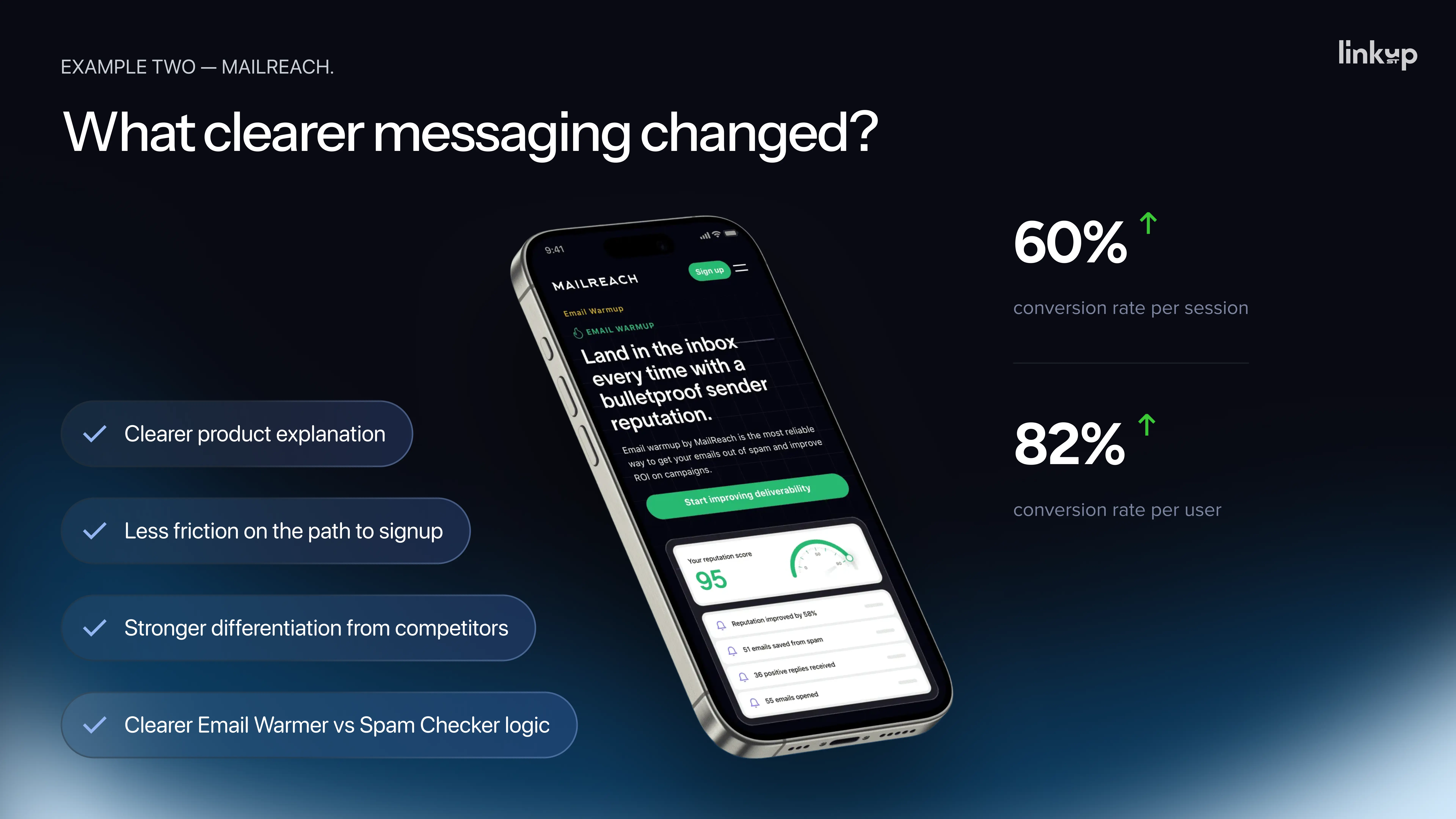
Mailreach helps companies improve email deliverability — ensuring emails land in inboxes rather than spam folders. The product itself was strong. The website was not communicating that strength.
The specific problems: visitors could not clearly understand the difference between the two tools Mailreach offered, could not see how they worked together, and could not understand why Mailreach was worth more than cheaper all-in-one competitors. The team had a clear internal explanation for why their product was better. Externally, that logic was invisible.
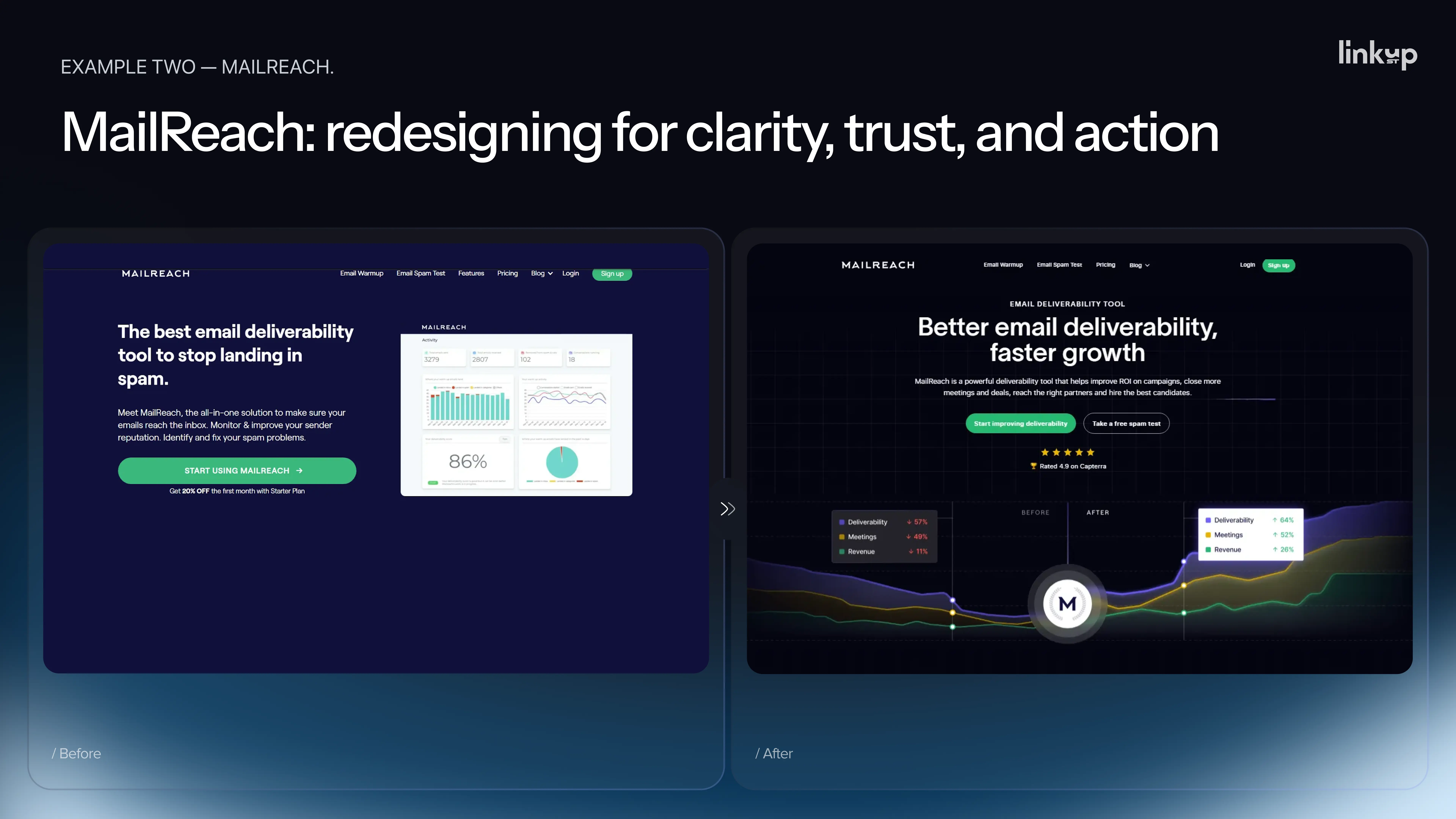
The redesign that followed was not cosmetic. It was a clarity redesign. Mailreach restructured their homepage message, clearly differentiated their two products, added a competitor comparison section, and modernized the visual to match the premium positioning the product deserved. The result, according to their published case study: a 60% increase in conversion rate per session and an 82% increase in conversion rate per user.
This is the case closest to what most product teams are actually facing — not unicorn-scale transformation, but a focused intervention that fixed a real, measurable problem.
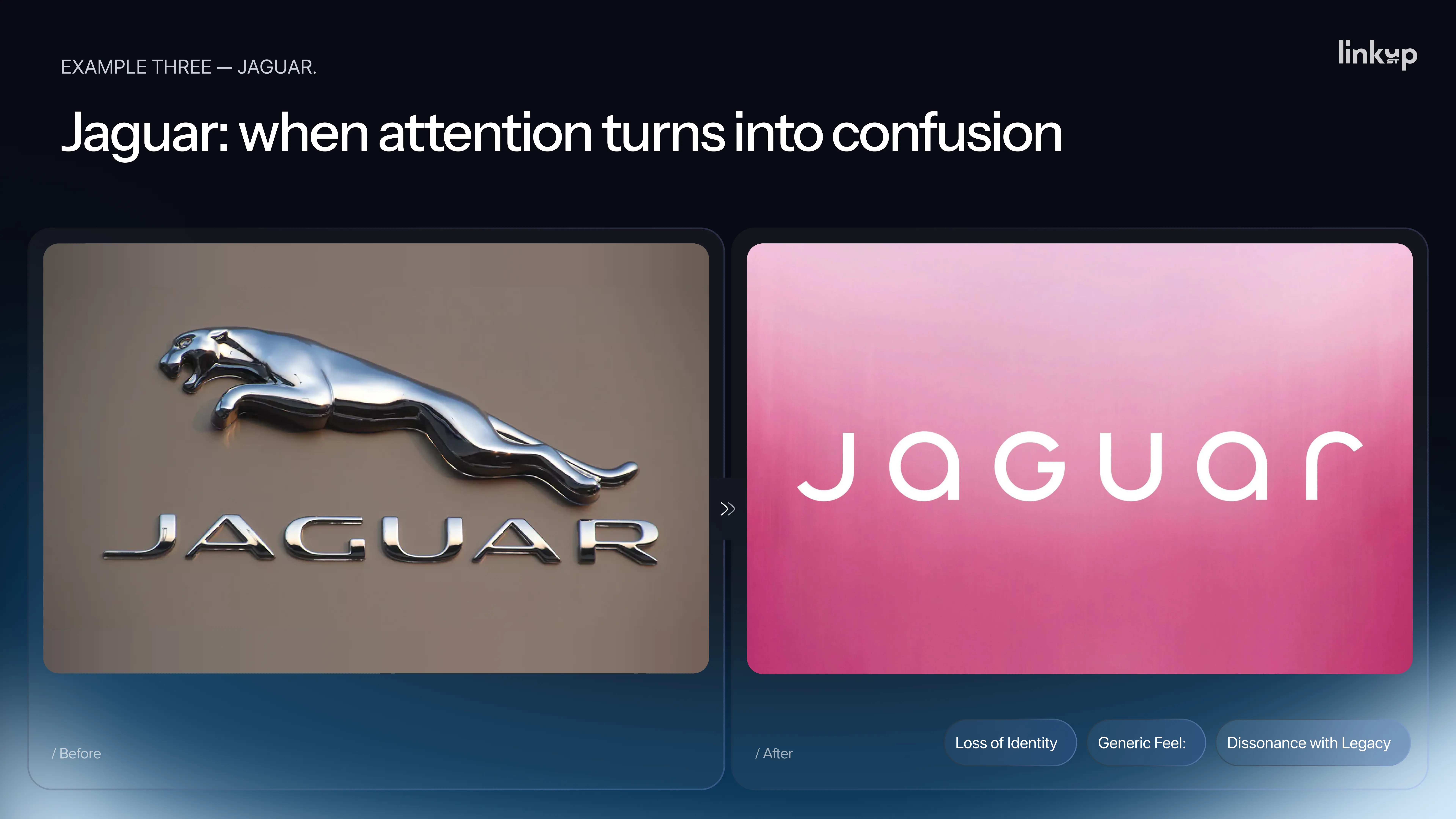
In late 2024, Jaguar launched a bold rebrand. New wordmark, new visual language, a fashion-forward campaign, and — most notoriously — no cars in the launch video.
The reaction was large. Large does not mean positive. CNBC reported widespread online criticism. Elon Musk's three-word response — "Do you sell cars?" — became the most accurate summary of the audience's confusion.
The commercial numbers made the story worse. In April 2025, only 49 new Jaguars were registered across Europe and the US, compared to roughly 2,000 in April 2024. A more than 90% drop. From January to April 2025, registrations were down 75% year over year.
To be fair, the rebrand was not the only variable. Jaguar had reduced its existing lineup while preparing for an electric vehicle relaunch, leaving dealers with very little to sell. But that context reinforces the lesson rather than undermining it: a rebrand cannot work alone. When product strategy, customer expectations, and commercial timing are misaligned, the attention a bold rebrand generates can turn into confusion that damages the business.
You cannot redesign simply because you have an opinion that it is time. You need a specific problem to solve, or something new to communicate — and you need the rest of the business to be ready to support it.
In our experience across dozens of projects, teams usually arrive at the redesign conversation through one of five triggers. Each of them sounds legitimate. None of them, on its own, is a real business case.
This is the most common trigger by far. The site is two or three years old. The founder has looked at it ten thousand times and is sick of it. But most customers have seen it once, maybe twice. What feels old to you can feel entirely new to them. Founder fatigue is not a user problem.
This one feels like strategy because it sounds external. They moved, so we have to move too. But you do not know if their redesign worked. You only see the launch. You do not see their numbers. They could be six months from a Jaguar moment. I know this one personally. "A direct competitor launched a beautiful new website. I spent around three months on a redesign in response, launched it — but the numbers didn't move. Six months later, we found out their redesign hadn't moved their numbers either. We were both running from the same ghost. That was an expensive lesson," — Pavlo Savchenko.
New people join wanting to make their mark. Fresh eyes and strong opinions. The test is simple: their opinion is worth exactly as much as the data behind it. If they say it looks outdated and bring a bounce rate comparison to industry benchmarks, listen. If they only say it looks outdated, that is a taste preference, not a strategy.
This sounds like a market signal. Before you act on it, ask: how many clients? When? In what context? In most cases, it is two or three comments from prospects who did not buy anyway, and sales is looking for something to blame. A pattern across at least twenty sales conversations is a signal. A few stories are not.
Agencies sell redesigns. When they tell you that you need one, ask the same question you would ask a surgeon recommending an operation: what happens if we do not do it? What is the alternative? "A good partner will sometimes tell you not to redesign — because they think long term. If an agency cannot answer what happens if you don't, get a second opinion," — Pavlo Savchenko.
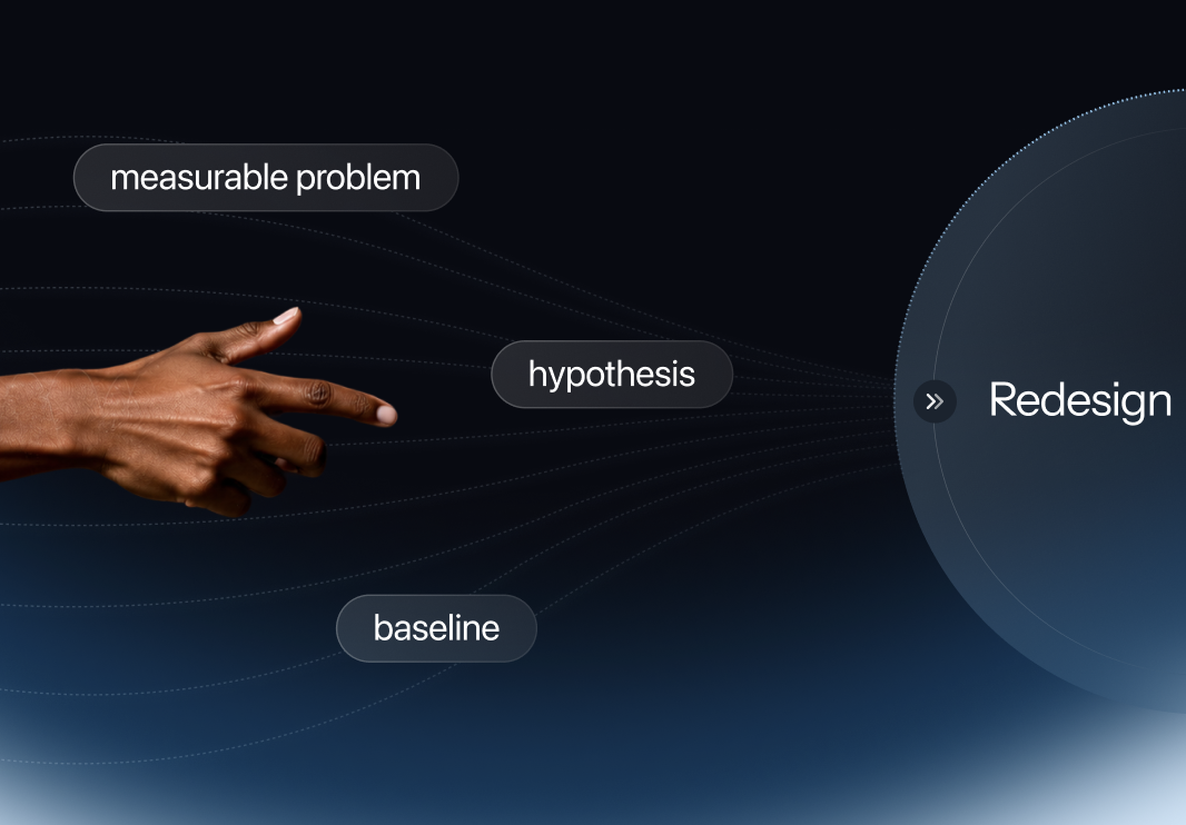
None of these five reasons, alone, is a real business case. They become one only when you add data: a measurable problem, a clear hypothesis, and a baseline you can compare against after the work is done.
.webp)
Once a team agrees something needs to change, the next question is almost always: is this a small problem or a big one? And this is where confusion becomes expensive, because what looks like a visual problem is often a UX problem, and vice versa.
The short version: a visual problem is when your product looks bad. A UX problem is when your product works badly — it is hard to use. They are not the same thing, and fixing the wrong one wastes every dollar you spend.
Daria, UI/UX Designer and Project Lead at Linkup ST, uses a house analogy to explain the four levels of design work — because the analogy makes the cost, scope, and appropriate context immediately clear for anyone, regardless of design background.
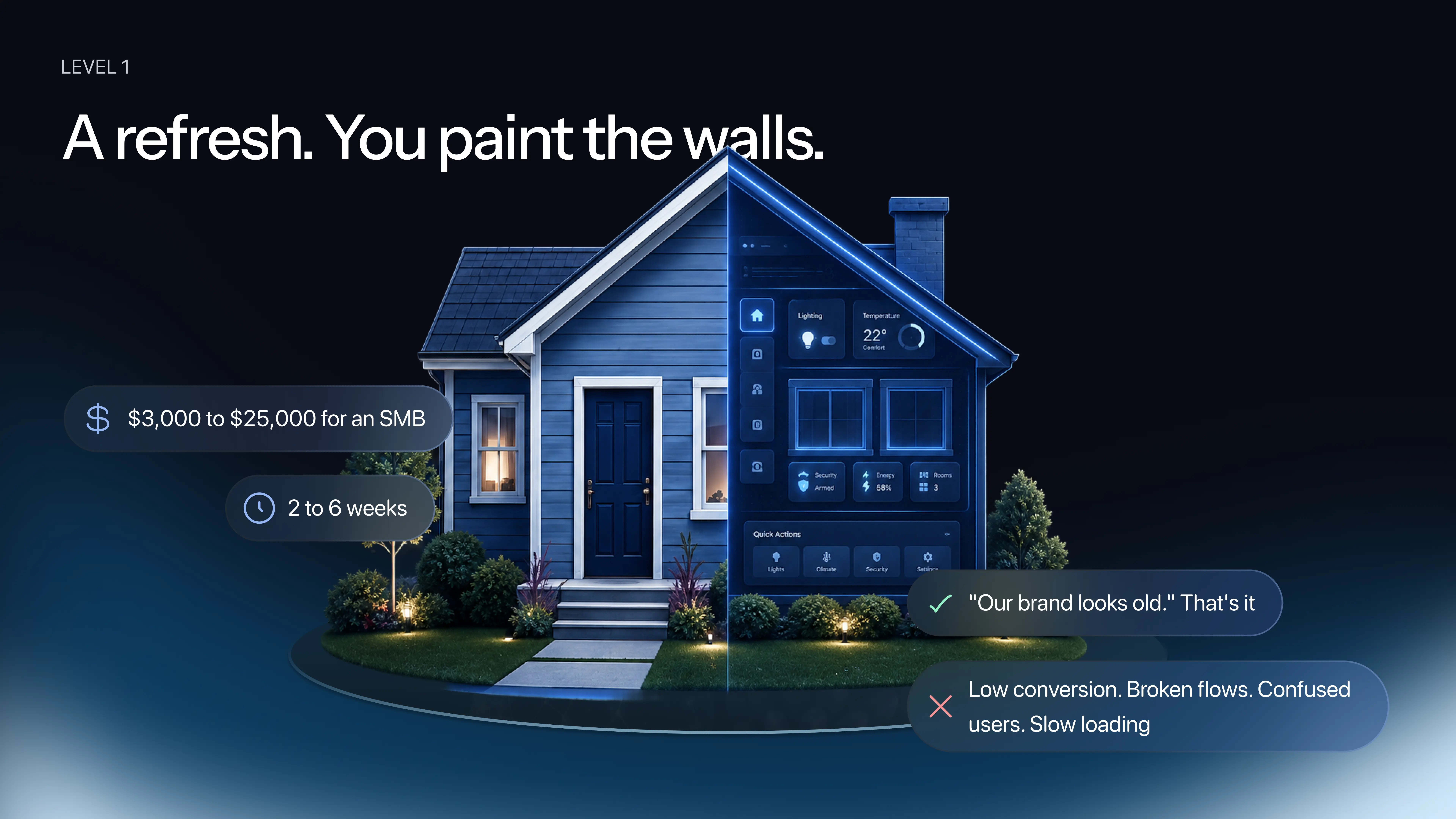
You are not touching the layout. You are not moving walls. You are not changing the pipes. You are making the house look fresher and more modern. For a website or product, this means updated colors, new fonts, better images, tighter spacing. Every page, every flow, every navigation structure stays exactly where it was. The product just looks current.
Approximate scope: days to weeks. Appropriate when the business is stable, the funnel is working, and the aesthetic is the only thing that has aged.
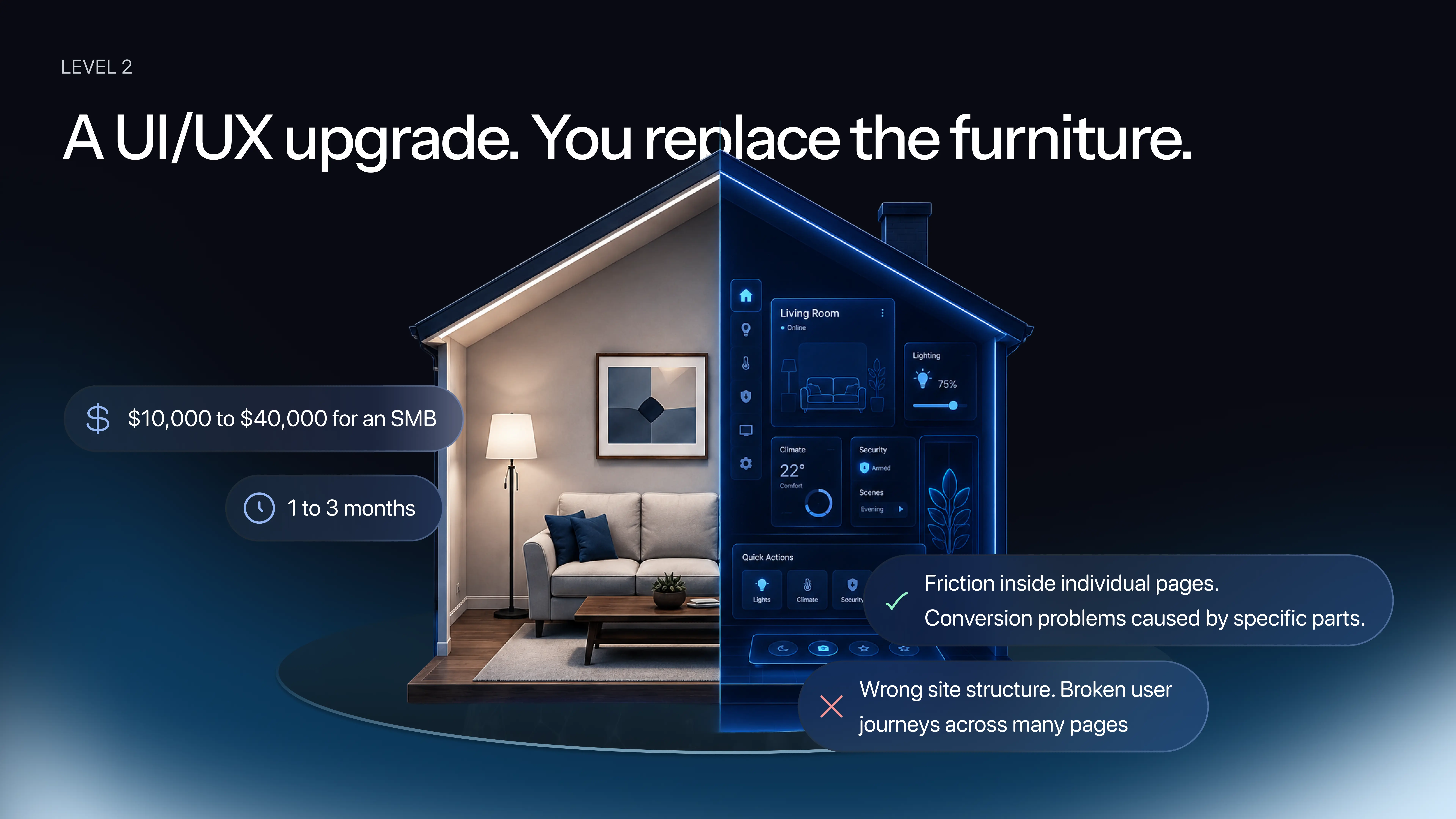
You are not breaking walls or moving rooms. You are buying better furniture and arranging it more intelligently. For a product, this means the site structure stays the same but individual components are rebuilt: smarter buttons, better forms, a cleaner pricing table, a simpler sign-up flow. Each piece becomes more usable — and fixing UI issues at this level often improves UX significantly, because a button with insufficient color contrast that users cannot click is technically a UI problem but creates a UX failure.
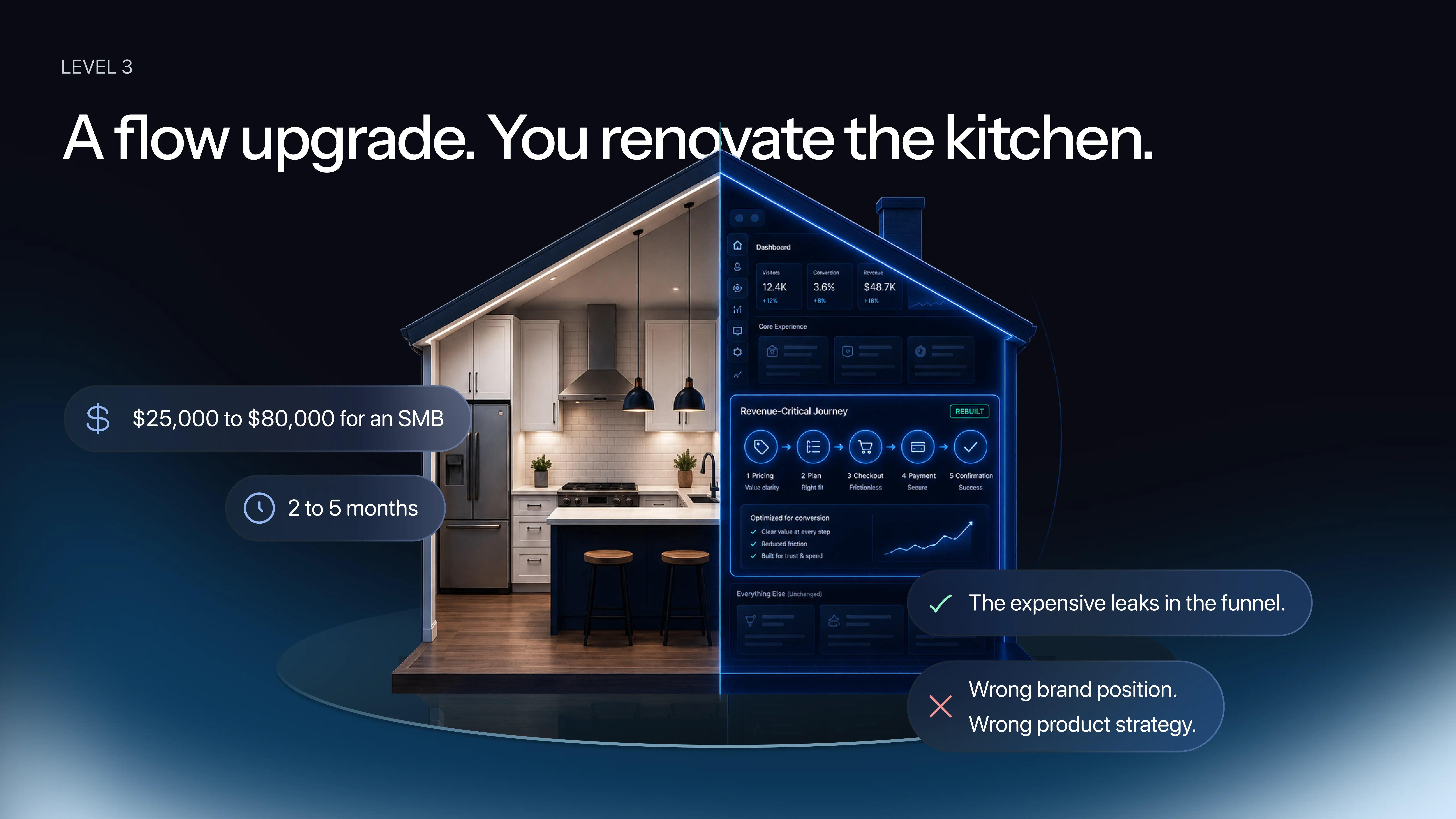
You are not rebuilding the whole house. You are taking the one room that matters most — the kitchen — and redoing it completely. For a product, this means leaving most of the site untouched while completely rebuilding a specific high-value journey: checkout, onboarding, the pricing-to-purchase flow. "Usually, that one where the money is," notes Daria.
This is the level most often underestimated. A Level 3 fix, combined with a light Level 1 refresh across the rest of the site, can look like a major redesign while costing significantly less — because the structural core is sound and only the critical conversion paths needed rethinking.
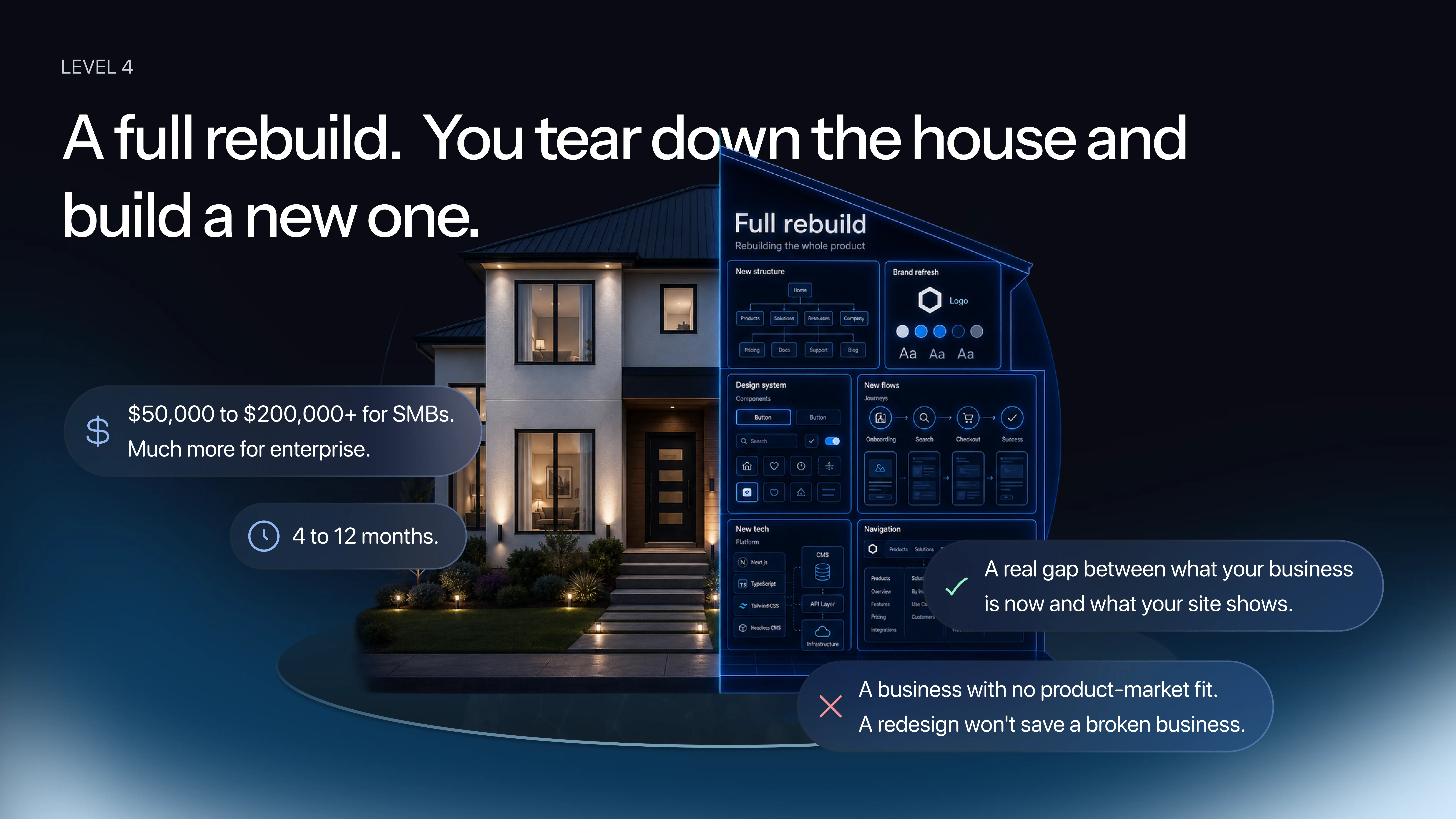
New structure, new design system, new flows, potentially new technology stack and new branding on top of everything. This is not painting. This is not furniture. This is foundation-up.
The most common mistake we see: small businesses come in asking for Level 4, ready to commit months and significant budget, when a Level 2 or 3 intervention would solve their actual problem better and faster. The opposite also happens — someone wants their site to look cooler, but the structure and flows are broken, and no amount of visual polish will fix a conversion problem rooted in information architecture.
Daria shares a real example: "Last year, a fintech founder came to us confident he needed a full rebuild — everything. We ran a one-week audit first. The structure was actually fine. The problems were specific: the pricing page had a confusing table, the sign-up flow had too many drop-offs, and the homepage hero wasn't communicating the product's value. Six to eight weeks of focused work, and his conversion doubled. If we had done the full rebuild he came in asking for, nobody knows what the result would have been."
Knowing the four levels is not the same as choosing between them. Most teams freeze at this point, or worse — they guess. And guessing at this stage is exactly what makes redesigns go wrong.
Here is a practical decision tool in two parts.
New audience, new product, new pricing model, a pivot. If something fundamental shifted, you are heading toward a redesign. If you are telling the same story to the same people, you are probably looking at a refresh.
Not a feeling. Not a few anecdotes from sales. Bounce rate twice the industry average, conversion at half where it should be, a specific step where users consistently drop. If you have that level of evidence, a redesign is on the table. If your numbers are roughly healthy, a focused refresh is more appropriate than a rebuild.
A real Level 4 rebuild takes months and serious investment. Teams that try to stretch a Level 2 budget into a Level 4 project end badly, every time. If the budget is not there yet, do the refresh now, prove it works, and build the case for the bigger investment later.
If all three answers point to business change, bad data, and real budget: full redesign. If you have a stable business, acceptable data, and limited budget: refresh. Anything in between — keep reading.
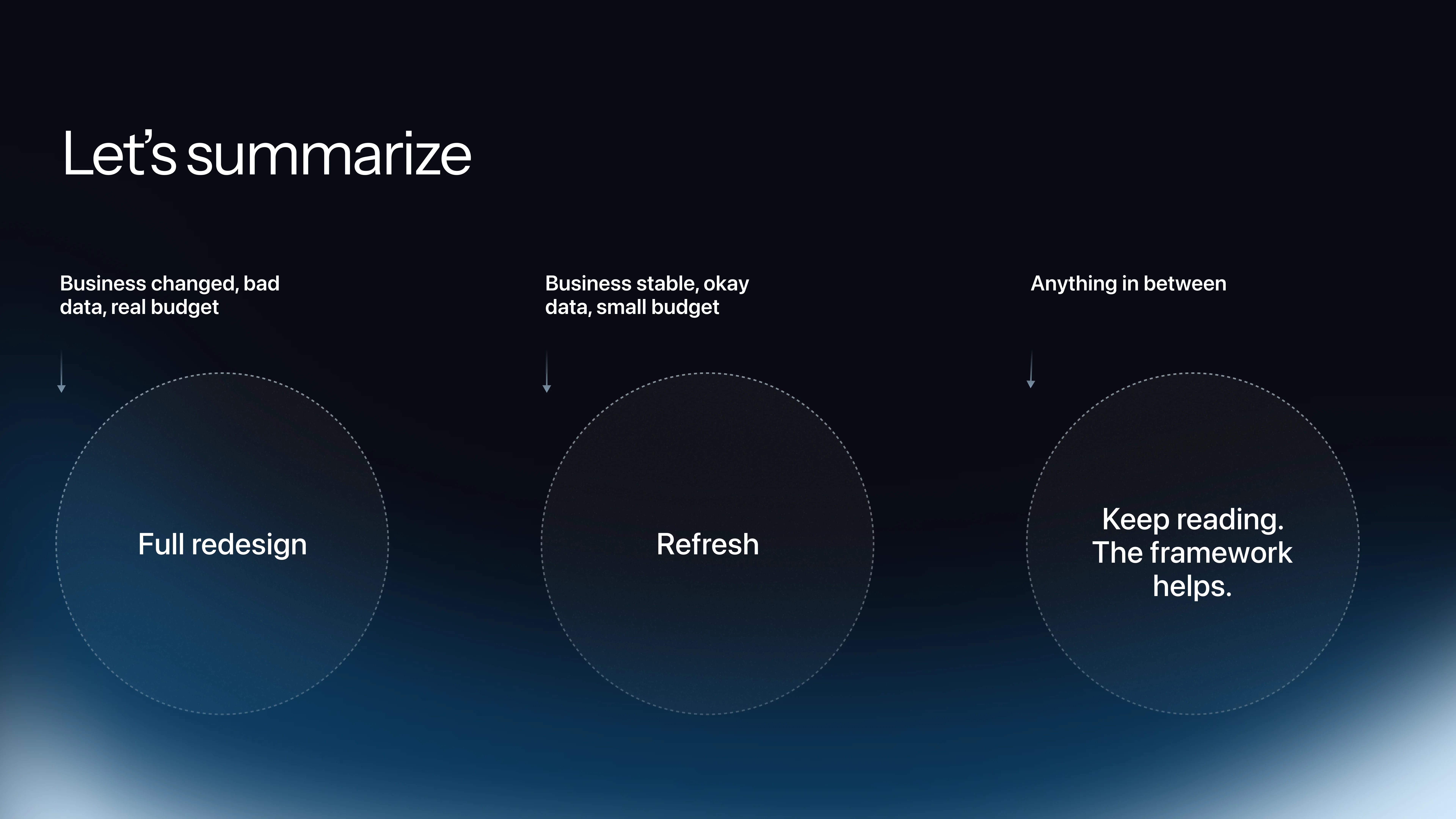
Most teams have mixed signals. Here is a two-column view. Notice which column you are nodding at more. That is your answer.
You need a full redesign when: your business has fundamentally changed (new audience, new product, new pricing — like Vercel outgrowing its old identity); you have real data showing funnel problems (bounce rate twice the average, conversion at half, support fielding the same five questions every week); users cannot find what they need and cannot understand what you do in five seconds; your technology cannot keep up with what you need to ship; a real competitor is winning deals you used to win because their story is clearer and their onboarding is faster — and you have proof of it.
Three or more of those: you are looking at a rebuild.
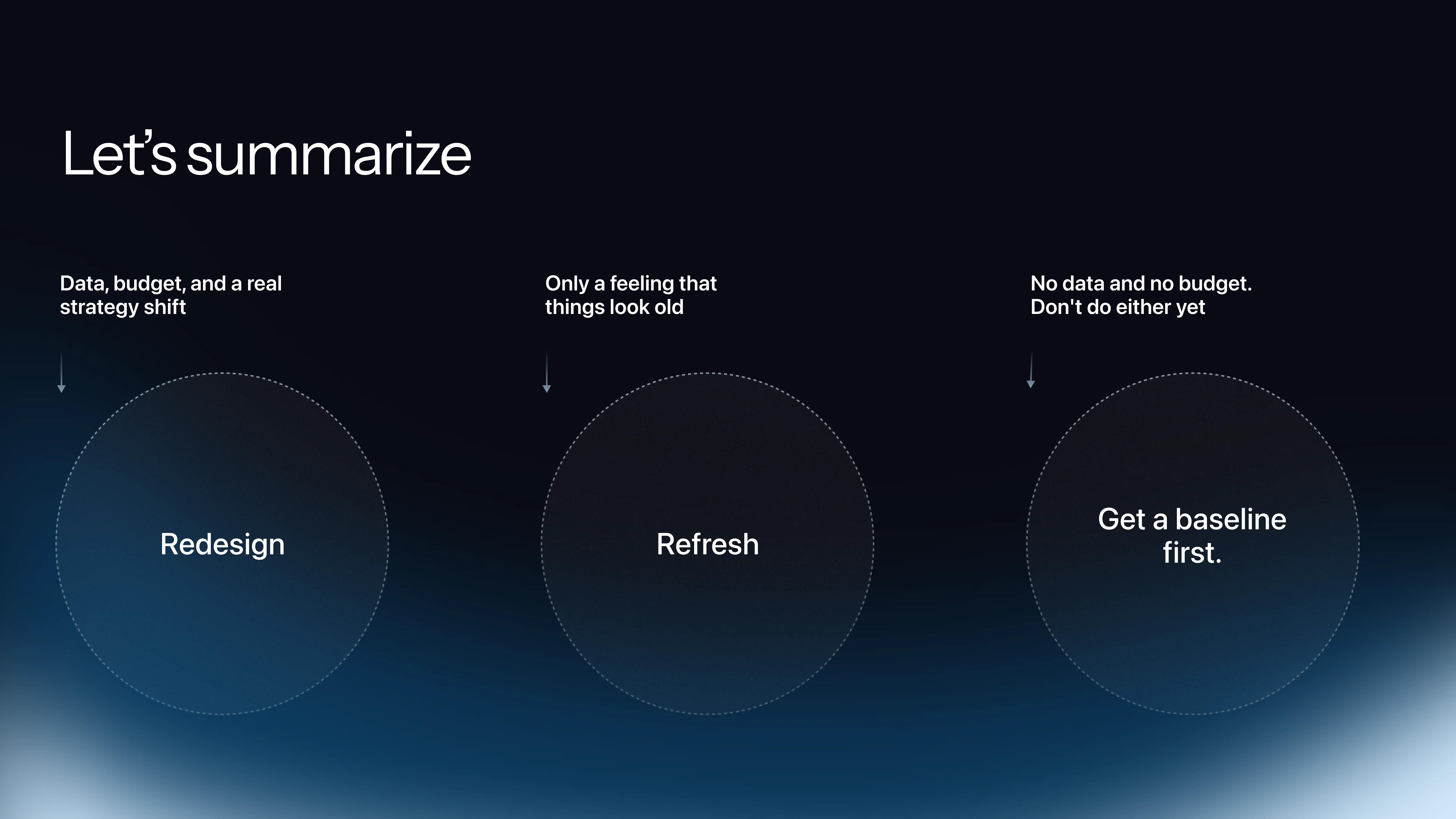
You need a refresh when: the business is stable and the look is just dated; conversion data is actually decent for your industry; budget is limited and runway is short; the brand direction is right but execution is inconsistent — different colors on different pages, different button styles — because inconsistency cleanup is some of the highest-ROI design work you can do; you are in the middle of a strategic shift. Do not redesign during a pivot. Refresh now, redesign after, because the worst outcome is launching a beautiful site that is already outdated on day one.
One important failure mode to flag: most teams fail on Question 2 not because they lack data, but because they lie to themselves about what they have. When asked what their conversion rate is today versus six months ago, most cannot answer precisely. They have a number from a dashboard they glanced at once a quarter. That is not data. That is a glance. The framework only works if you are honest about what you actually know versus what you assume.
"Every design decision without a baseline is like taking medicine without understanding the disease you are trying to treat," — Daria, Linkup ST.
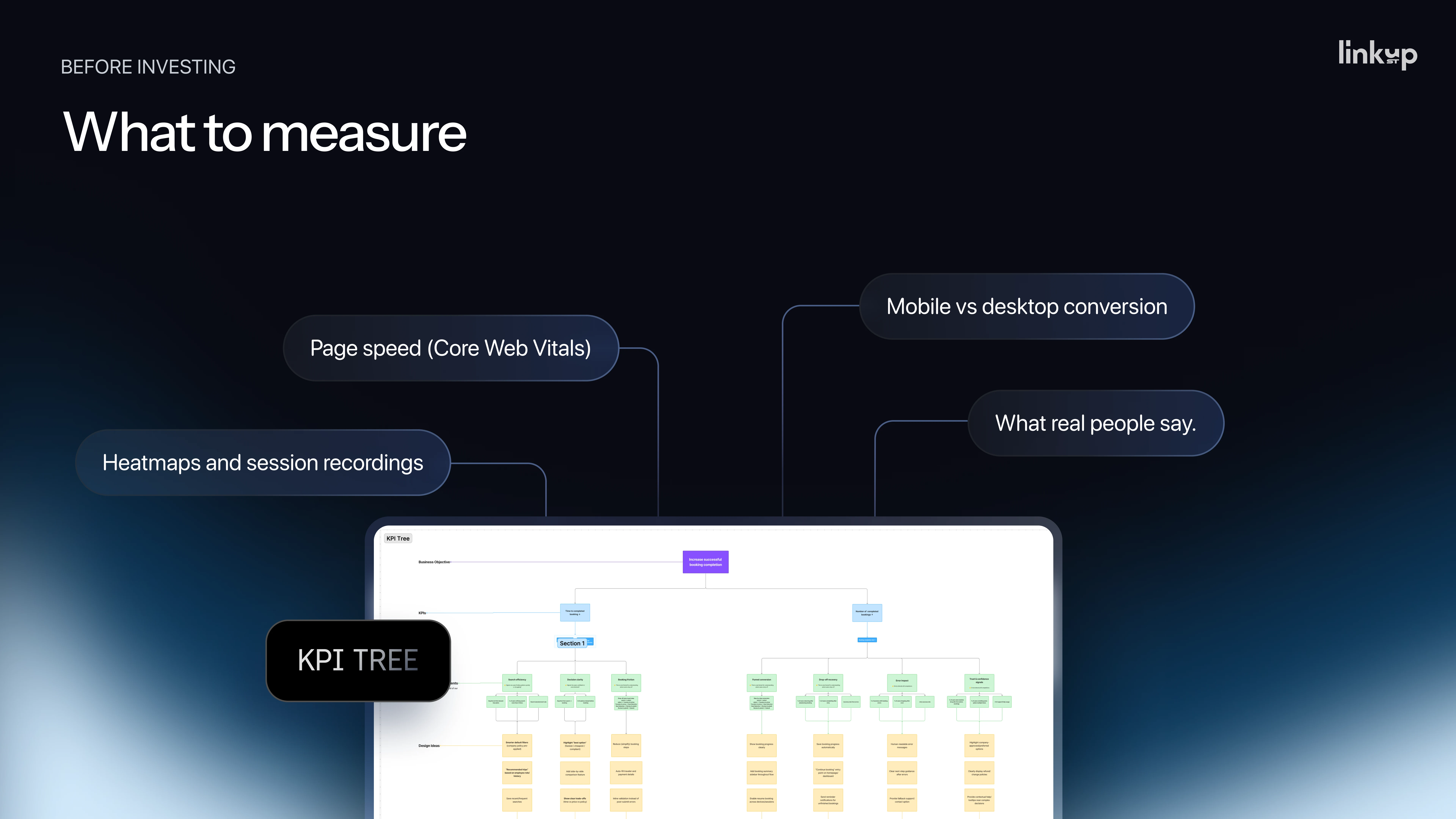
The industry standard for clean baseline data before any redesign decision is 30 to 90 days. This is not an arbitrary number — it is what analytics professionals consistently recommend as the minimum window to separate noise from signal. If you do not have it, you are not ready to spend budget on redesign work.
Conversion rate is the starting point: what percentage of visitors complete your primary action — sign up, book a demo, make a purchase. Two percent can be excellent or catastrophic depending on your industry. Always compare against your sector benchmark, not an abstract ideal.
Conversion rate by traffic source reveals where your audience quality varies. Paid ads, organic search, and referral traffic often behave very differently, and understanding which source converts tells you where to focus.
Drop-off rate by step is essential for any multi-step flow: sign-up, checkout, onboarding, booking. It shows you exactly where users leave, which is where your redesign budget should go.
Time on page and scroll depth tells you whether users are actually reading your content or bouncing past it. If users leave before reaching your value proposition, reordering sections may matter more than redesigning them.
Session recordings are where the numbers become understandable. Quantitative data tells you something is wrong. Session recordings tell you what is wrong and why — how real users actually behave with your product, where they hesitate, where they click the wrong thing, where they give up. "You will be surprised how users actually use your website," Daria notes. Start with Microsoft Clarity or Hotjar — both free, both immediately useful.
Mobile versus desktop conversion reveals whether your product is failing a specific segment of your audience.
Direct user feedback — whether from one-to-one interviews, a conversation with your support team about recurring complaints, or a simple feedback form — adds the qualitative layer that metrics alone cannot provide.
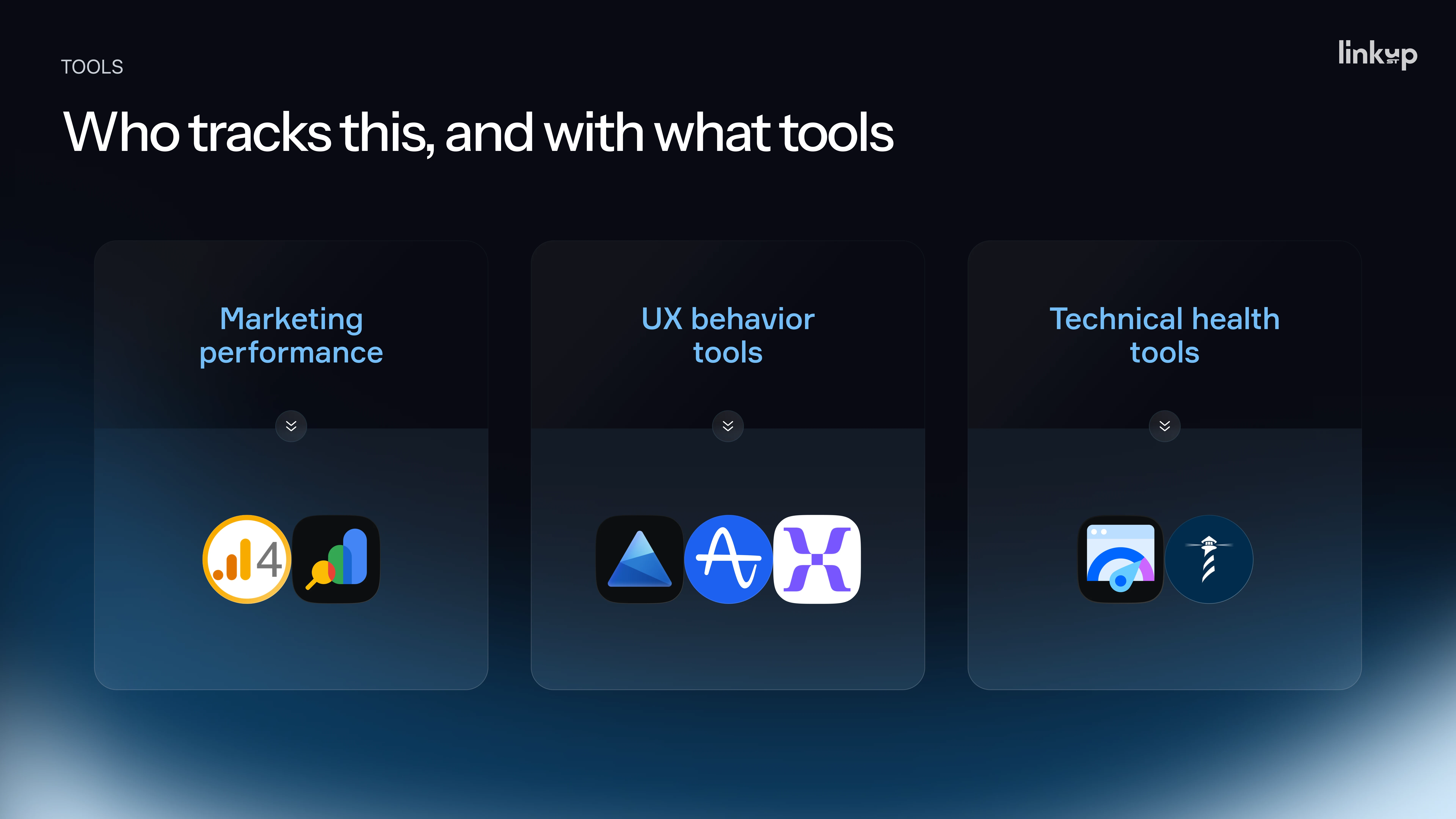
For commercial and traffic data: Google Analytics and Google Search Console cover the majority of what most teams need.
For UX behavior: Microsoft Clarity and Hotjar are free starting points. Amplitude and Mixpanel offer more depth for teams ready to invest in analytics infrastructure.
For technical health: Google PageSpeed Insights and Lighthouse check load time and performance issues that affect conversion independently of design quality.
One important organizational note: the biggest issue is usually not tool selection — it is ownership. Someone needs to own the baseline. Pick one person, give them 30 to 90 days, and make metric collection their explicit responsibility. Without ownership, data collection becomes nobody's job.
Pull the last 30 days of analytics from Google Analytics — even messy data is better than no data. Install Microsoft Clarity and start reviewing session recordings immediately. Sit down with one person from your sales or support team and write down the top recurring complaints from users. That is a few days of work, not a 90-day project, and it gives you enough signal to make a more informed decision than pure intuition.
Redesign and refresh are not design decisions. They are business decisions with five- and six-figure price tags attached. The difference between getting it right and getting it wrong is not talent. It is not budget. It is whether you got the diagnosis before you bought the medicine.
The framework in this article will not make the decision for you. But it will stop you from making it on feelings, competitive anxiety, or the opinion of the last person who walked into the room. Those are the real reasons most redesigns go wrong — not the design work itself.
Before you commit to any scope of work: define what problem you are solving, find the data that proves it exists, build a baseline, and then choose the level of intervention that matches the actual problem. Start with the smallest change that could move the metric that matters. Prove it works. Then go bigger if the evidence supports it.
If you are working through this decision right now and want a second set of eyes before you commit to a scope or a budget, we are happy to look at your specific case.
..svg)
.svg)