Reimagining a сomplex B2B зlatform for simplicity and efficiency
Enterprise platform redesign
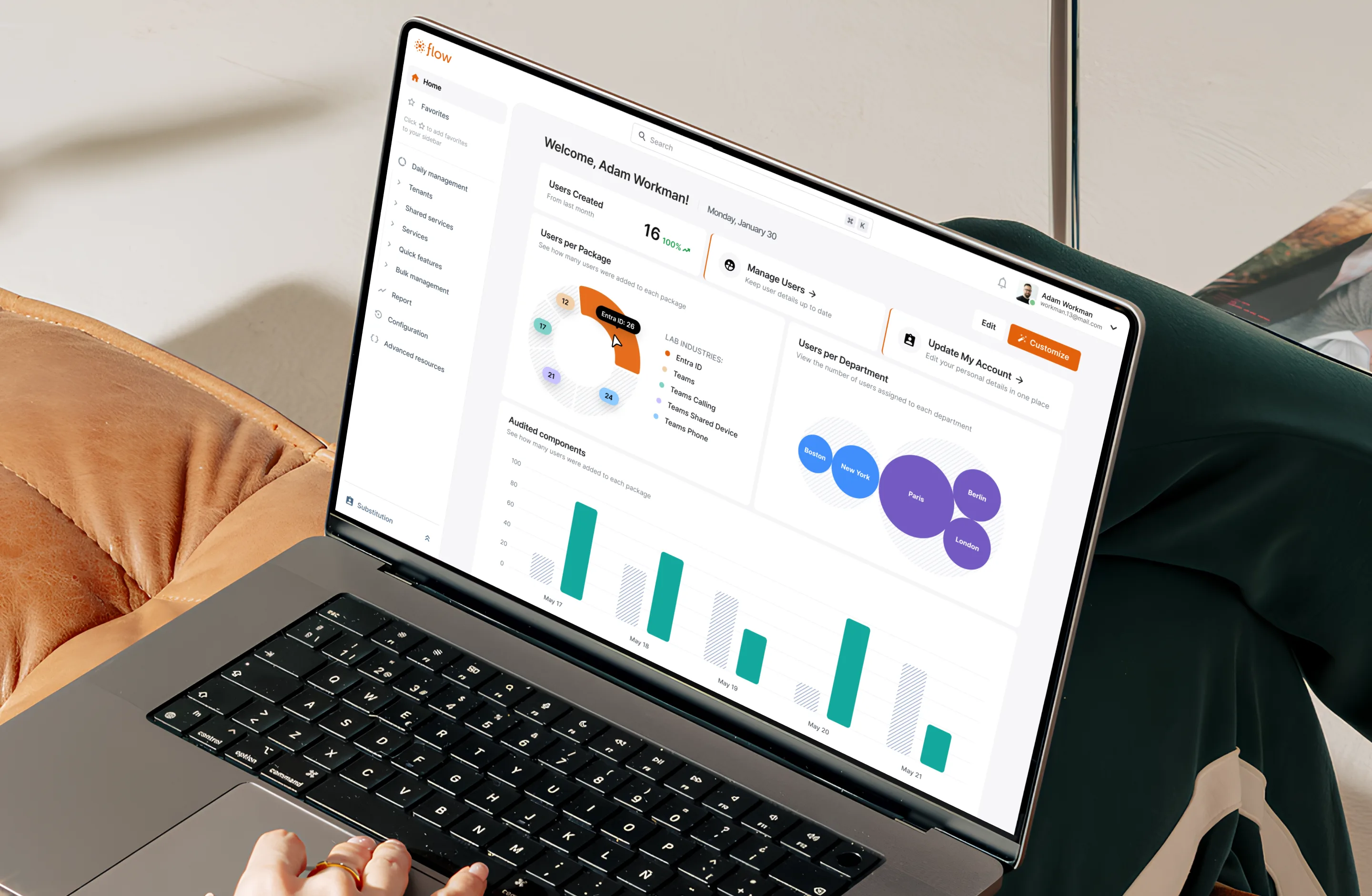
This is one of the leading enterprise platforms for corporate communications management, trusted by Disney, PepsiCo, and the European Parliament. A decade of engineering-driven growth made the product extraordinarily capable; however, over time, its interface became too complex for daily use. Thousands of IT administrators worldwide were spending hours daily inside a system that worked against them at every step. Navigation was convoluted. Forms were massive. Actions completed without feedback. Critical functions were buried. And the business felt it. Internal interviews revealed that clients were already looking toward competitors with sharper, more modern interfaces. When a platform's daily friction becomes visible enough for clients to notice, and to mention it, the problem has moved well beyond UX. It was a question of survival: retaining clients, protecting revenue, and proving that a decade of engineering investment still had a future.
Our task was to conduct a comprehensive redesign — simplifying key workflows, eliminating friction, and cutting a six-month onboarding curve. We had to transform a powerful but difficult-to-learn tool into an intuitive and efficient system, without a single minute of downtime. This is a story of evolution that brought technology closer to the people who use it.
Redesigning for scale
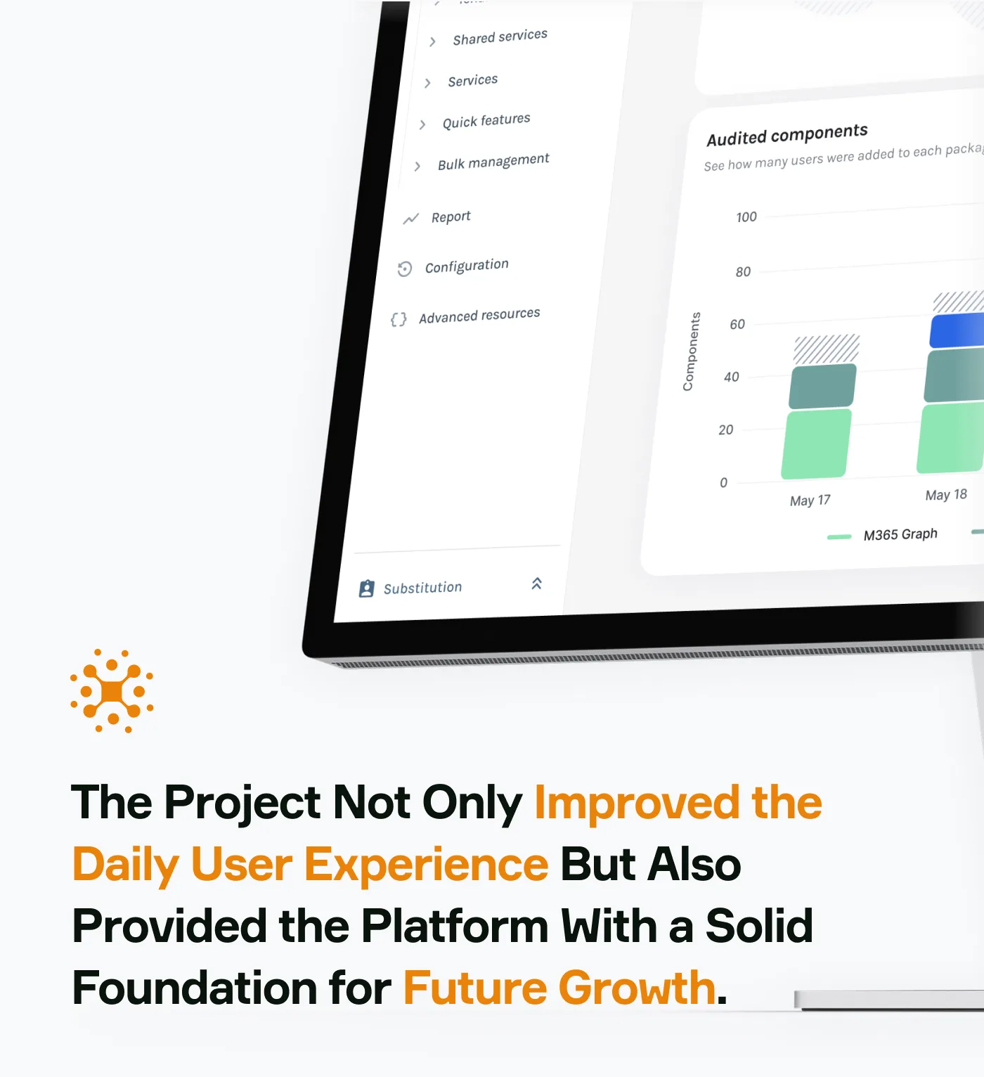
Thoughtful design decisions produced measurable outcomes across every metric that matters to enterprise clients — onboarding speed, task efficiency, feature adoption, and user satisfaction.The project not only improved the daily user experience but also provided the platform with a solid foundation for future growth.
Complexity at the user's expense
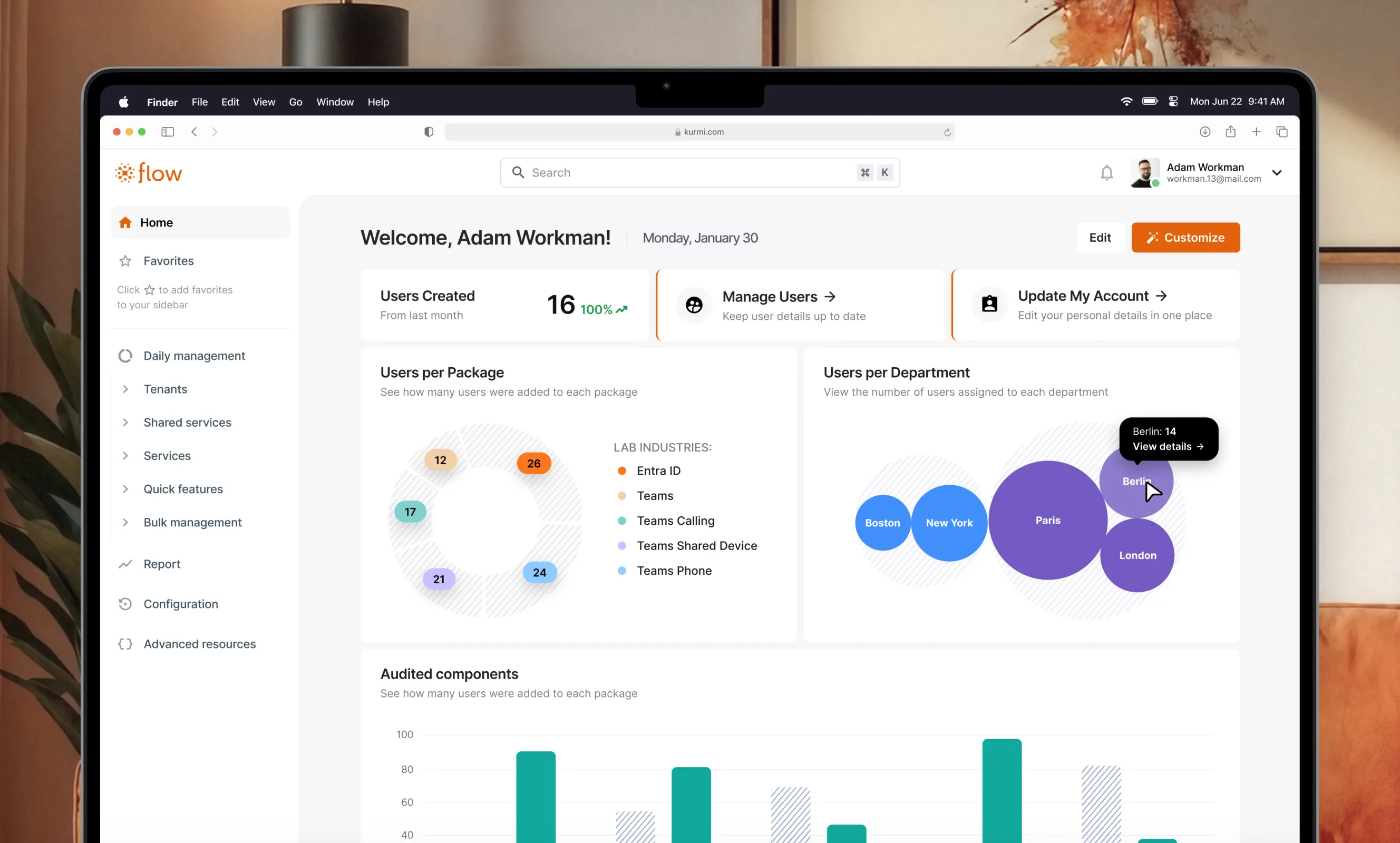
The core issue was that the platform, driven primarily by engineering logic, had become extremely complex over a decade of development. Its vast functionality was hidden behind a non-intuitive interface. For new users, this meant a steep learning curve of up to six months before they could work confidently. Navigation was convoluted, daily tasks required redundant steps, and a lack of visual consistency caused frustration. For IT administrators spending several hours a day in the system, this created a constant cognitive load and hindered operational efficiency.
The deeper constraint: this product couldn't be paused. It was used daily by thousands of active administrators across global organizations. Every design decision had to improve the experience without disrupting it. Beyond the interface itself, the architecture created its own rules. All UI components were shared system-wide — a change to any element propagated everywhere. Every decision had to be tested against dozens of scenarios before implementation to ensure nothing broke in an unexpected place.
Structure through research
Before opening Figma, we started with conversations. Sales reps, support teams, product managers, and most critically — the administrators who live inside the system for hours every day. 132 people participated across six distinct UX research methods.
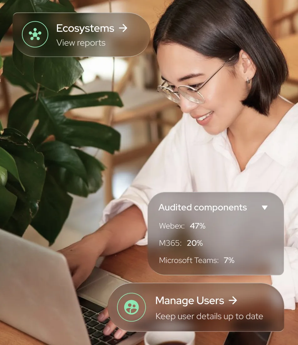
"My task was to present a massive volume of information so it was easy to read and genuinely useful — not random widgets on a page, but something that truly works for the user," — Linkup ST UI/UX designer.
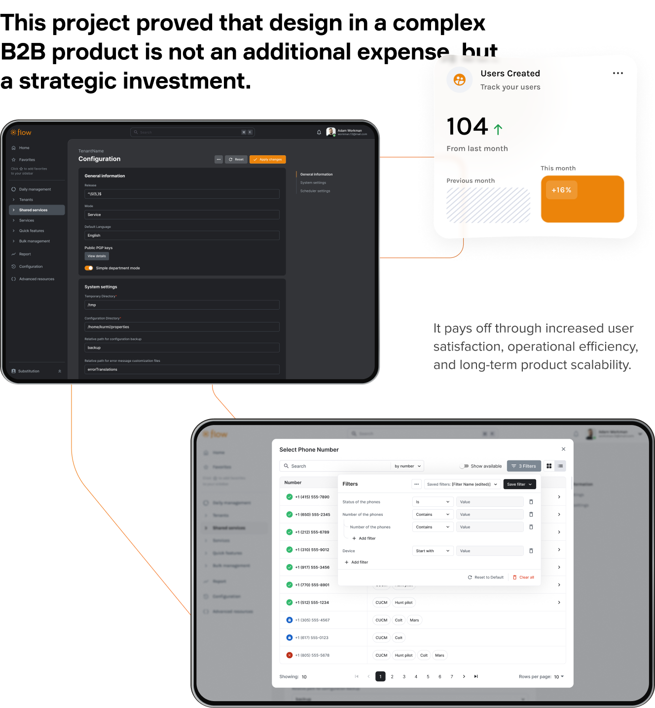
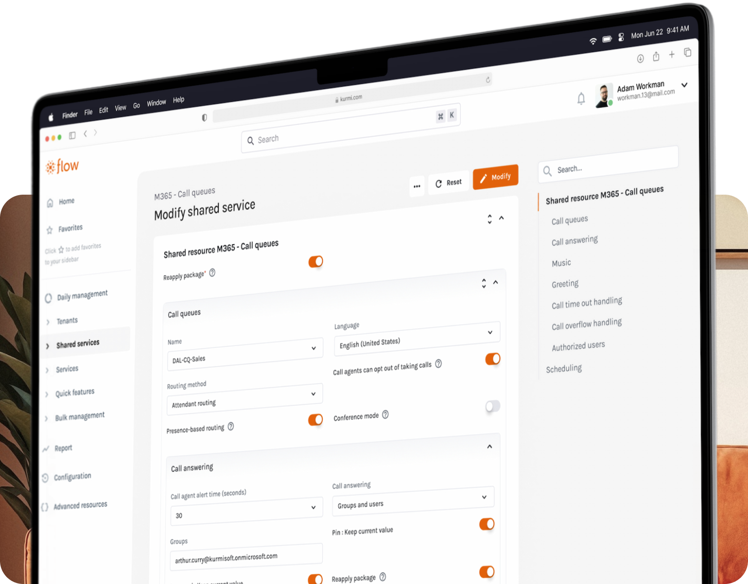
Dual form view. Testing revealed two fundamentally different working modes: auditing (need everything visible at once) and editing (need a compact, focused view). Instead of compromising between them, we gave users a toggle. One of the most persistent daily frustrations, eliminated.
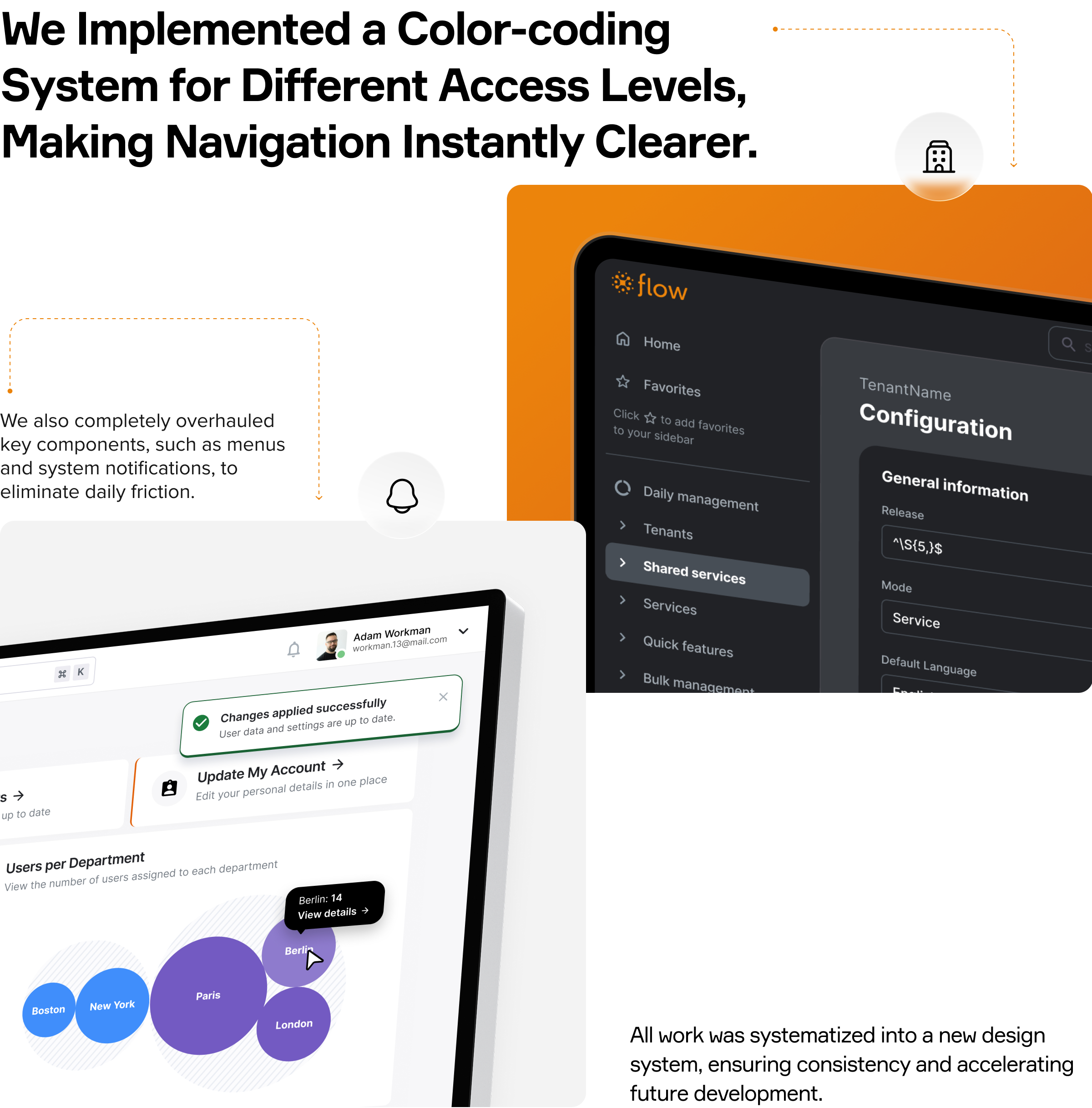
Color-coded access levels. Administrators constantly switch between system, department, and user levels. Without visual markers, context was lost constantly. We assigned each level a dedicated color — making the current state instantly readable without requiring users to read labels or trace breadcrumbs.
Navigation and notifications. Connecting lines in menu hierarchies gave users a clear spatial map within a complex structure. Notifications were redesigned to inform without overlapping critical controls or interrupting active tasks.
Dark mode. The top-requested feature — a functional necessity for engineers accustomed to dark code editors during multi-hour sessions.
Every decision was validated through iterative workshops with technical specialists, product managers, and real administrators. All solutions were codified into a unified design system, ensuring consistency and accelerating future development.
From functional to user-centric
The redesign didn't just improve the interface, it changed how thousands of administrators experience their work every day. The 3x onboarding reduction translates into direct cost savings for clients and faster time-to-productivity for every new hire. The 100% CSAT on release is the harder number to earn — it means a complex system overhaul that users immediately trusted rather than tolerated.
"It took me six months to fully understand this product myself. We did everything so that new users would never have to go through that same path again," — Linkup ST UI/UX Designer.
This project proved that design in a complex B2B product is not an additional expense, but a strategic investment. It pays off through increased user satisfaction, operational efficiency, and long-term product scalability.