.svg)

Ferrari Website Redesign: Emotion at Speed

Designing a Digital Ferrari Experience
Ferrari isn’t just about cars. It’s about how those cars make you feel — speed, control, presence. That’s what made this project interesting. We took it on as an internal initiative at Linkup ST to explore a simple question: what would Ferrari’s digital experience look like if it carried the same emotional weight as the product itself?
Instead of treating the website as an informational platform, we reimagined it as a luxury experience system — where visual storytelling, motion, and minimalism work together to create an immediate emotional connection with the brand.

The redesign shifts the role of the website from a functional tool to a brand-driven experience, where users don’t just explore Ferrari, they feel it.
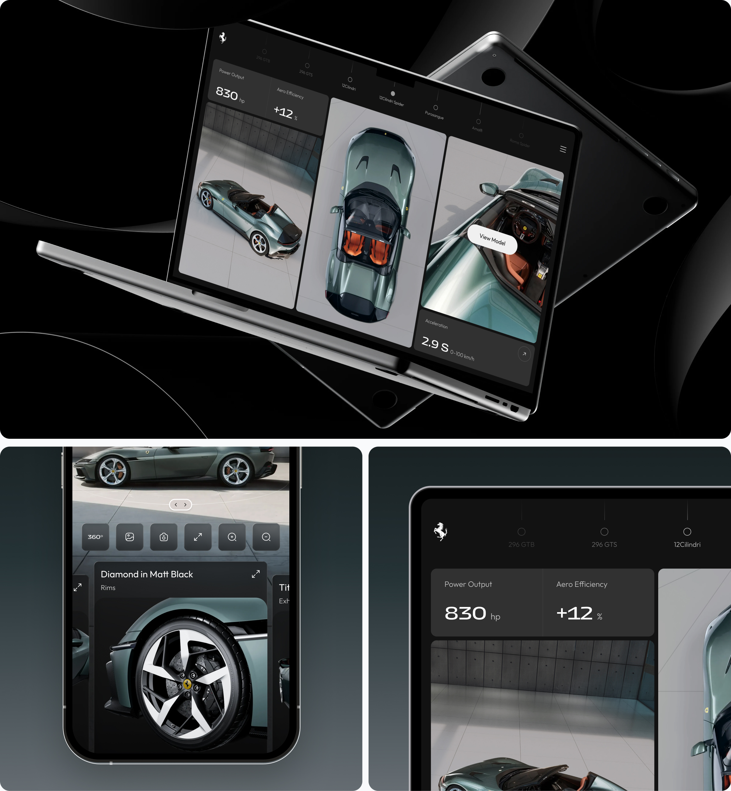
Most automotive websites are built to inform. They prioritize specifications, configurations, and structured navigation, often at the expense of emotional engagement.
For a brand like Ferrari, this creates a disconnect. The physical experience is defined by speed, precision, and intensity, while the digital experience remains static, predictable, and restrained.
Users are guided through conventional patterns that fail to reflect the brand’s identity. Instead of immersion, they encounter fragmented storytelling, divided attention, and a lack of sensory depth.
The result is a digital journey that functions but doesn’t resonate.
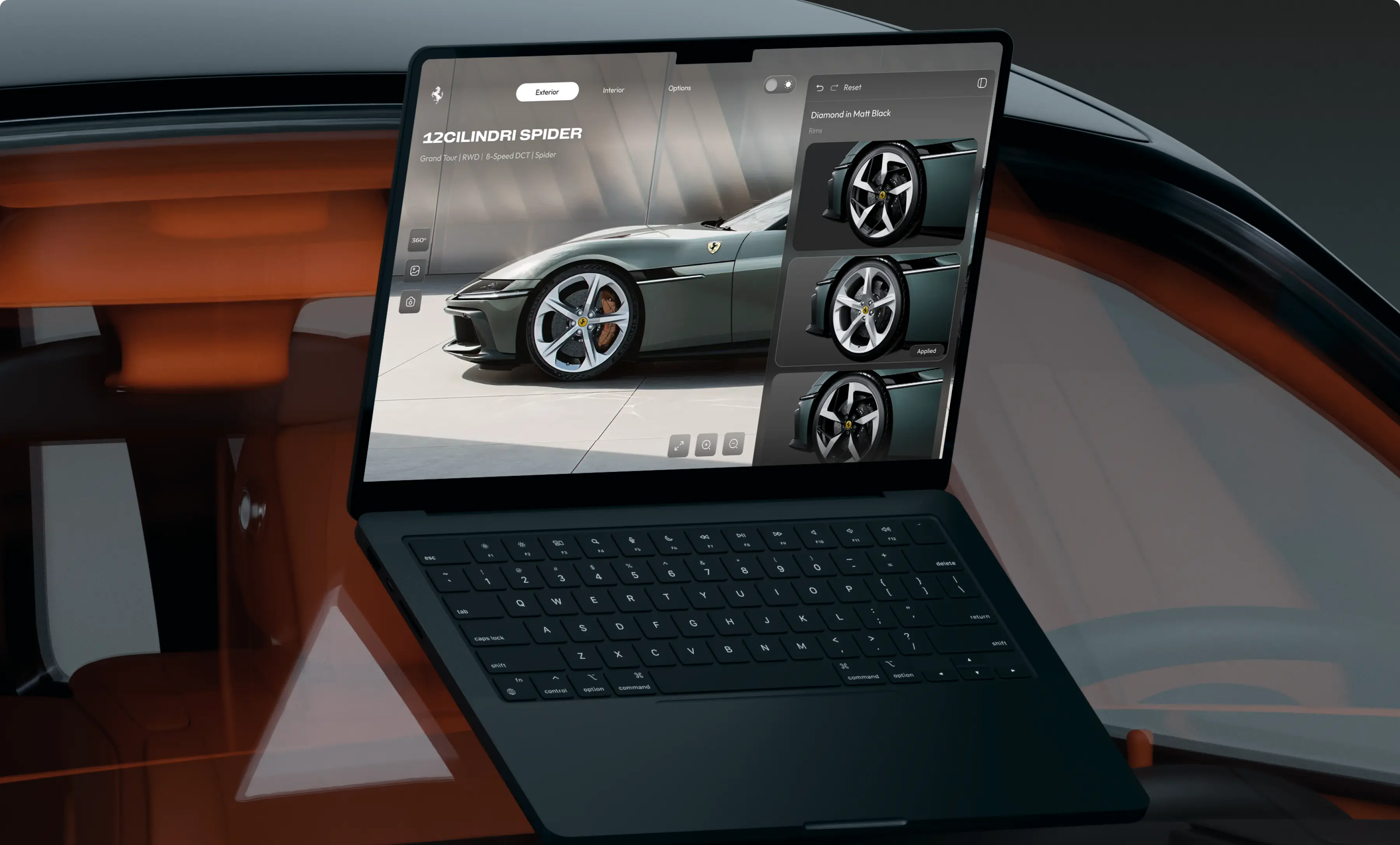
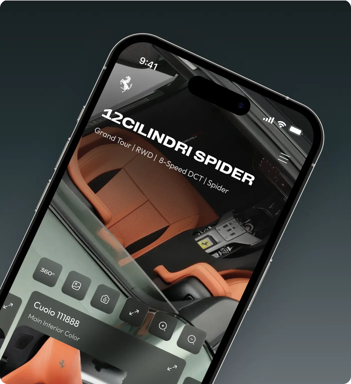
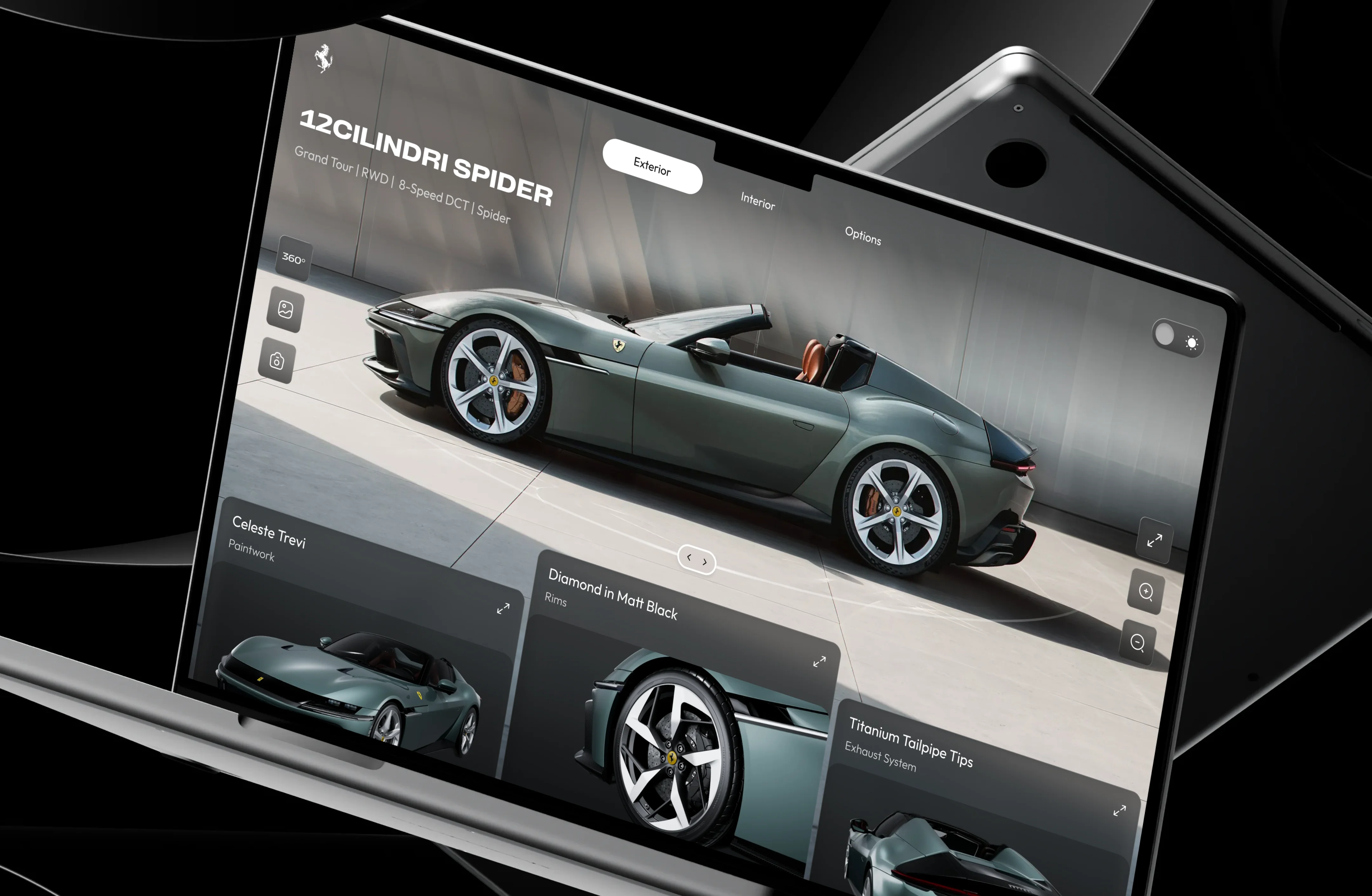
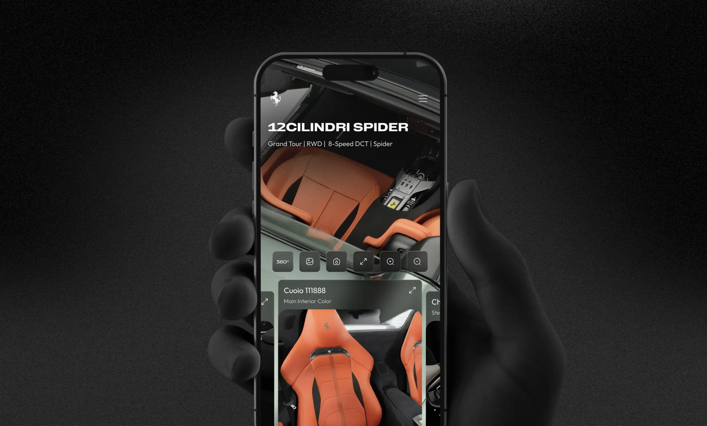
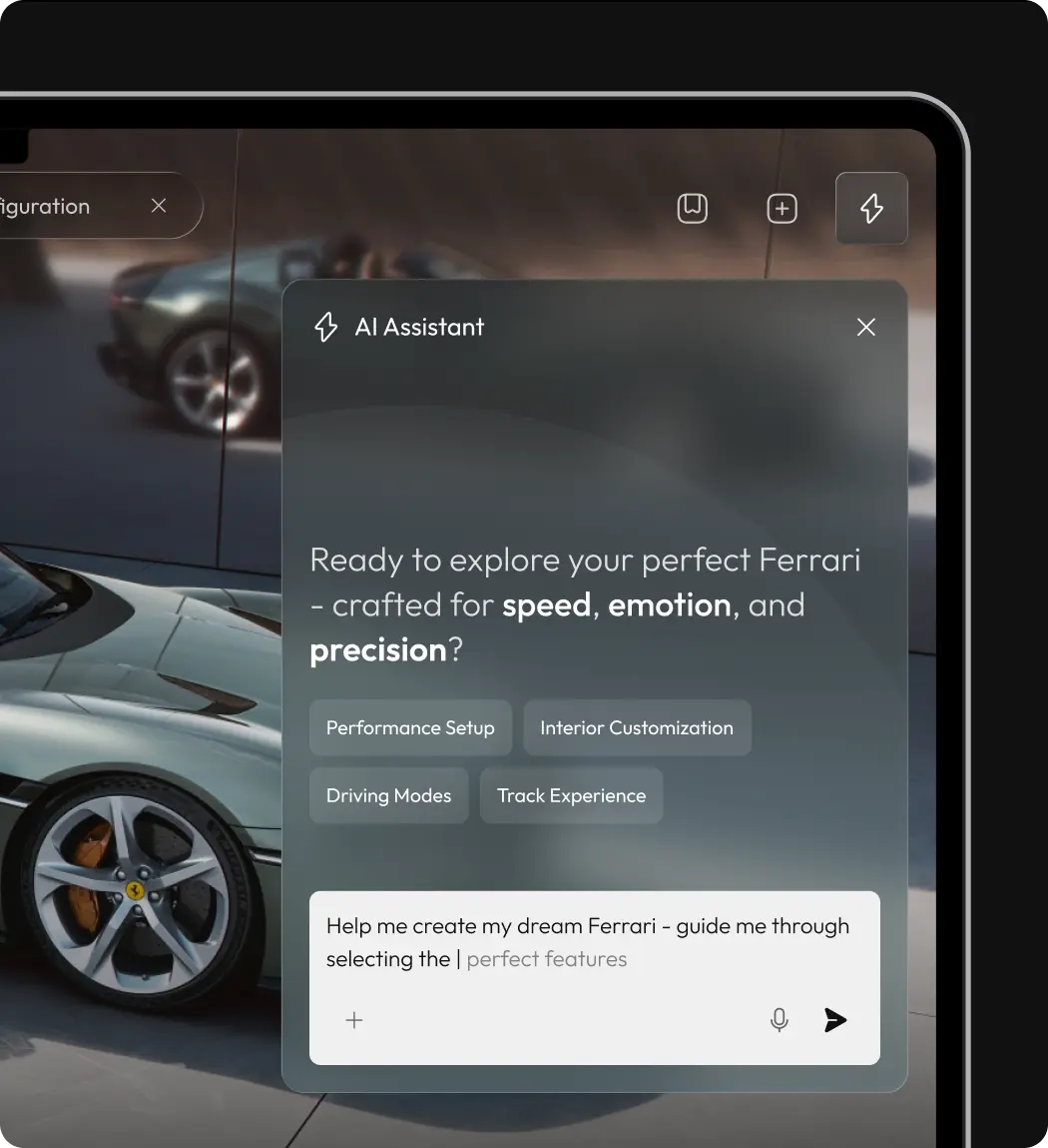
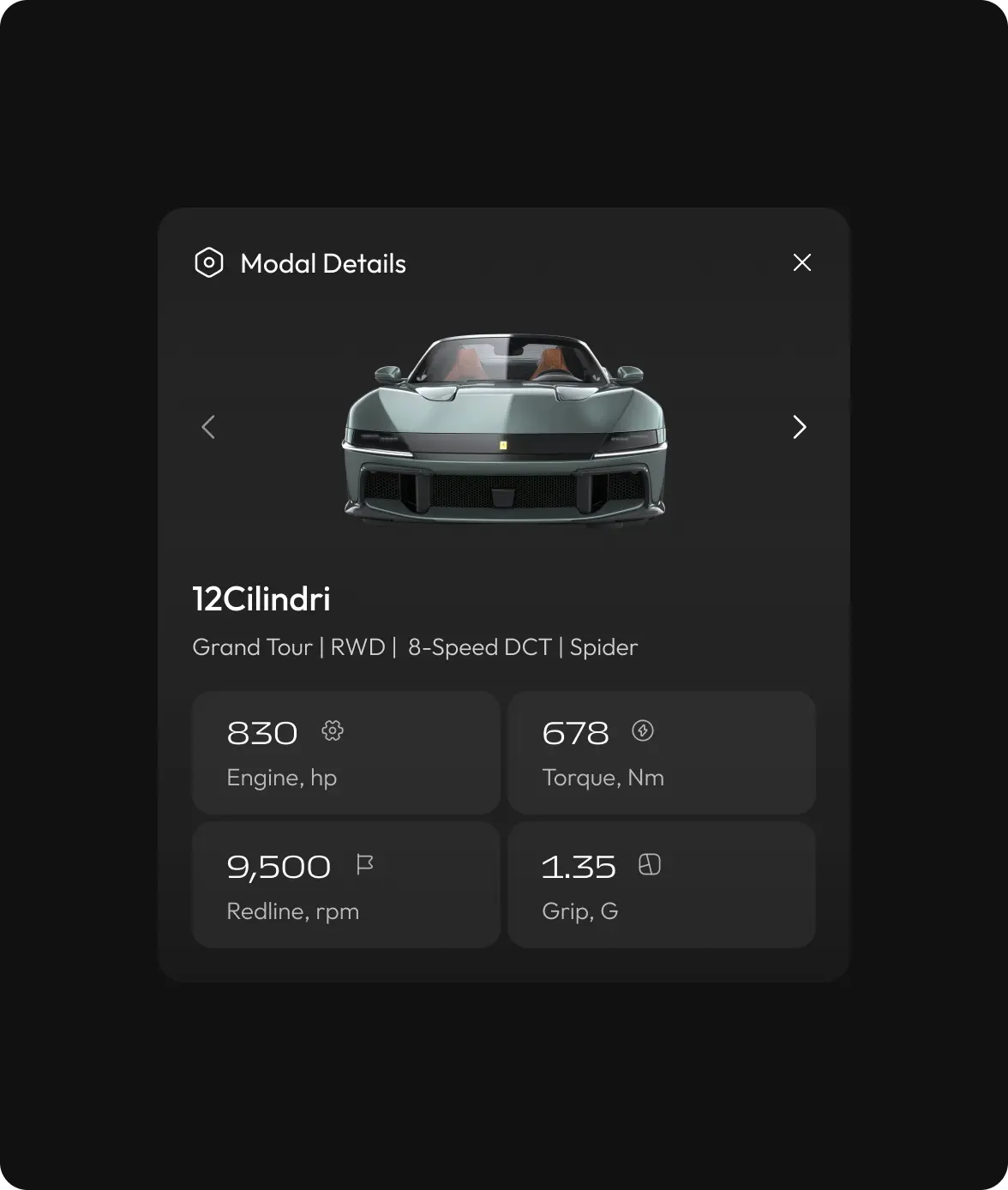
We approached the redesign as an experience system rather than a traditional website. Instead of organizing content around features and navigation, the focus shifted to creating a seamless, emotionally driven journey aligned with Ferrari’s identity.
The experience is built on three principles:
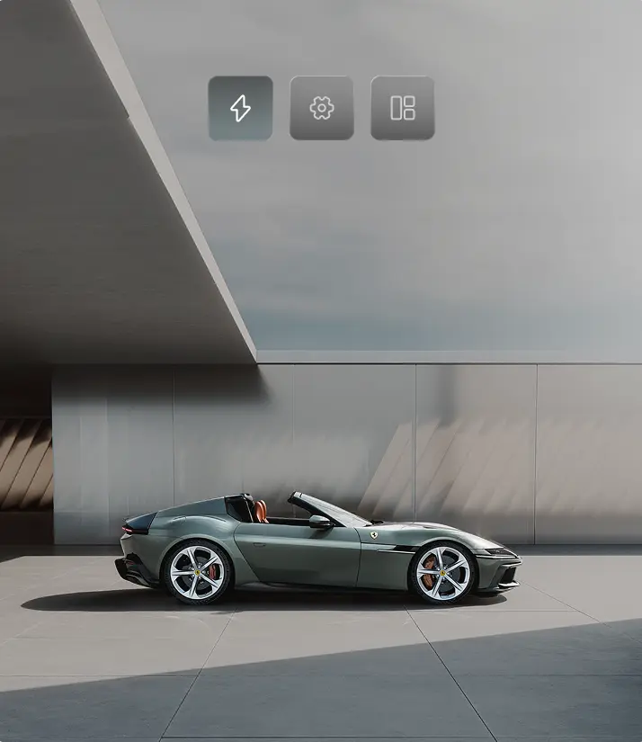
- Visual immersion — creating immediate emotional impact
- Controlled interaction — guiding users with precision and clarity
- Intentional simplicity — removing everything that doesn’t add value
Each screen is designed to deliver a single, focused message, while motion and transitions reinforce a sense of speed and control.
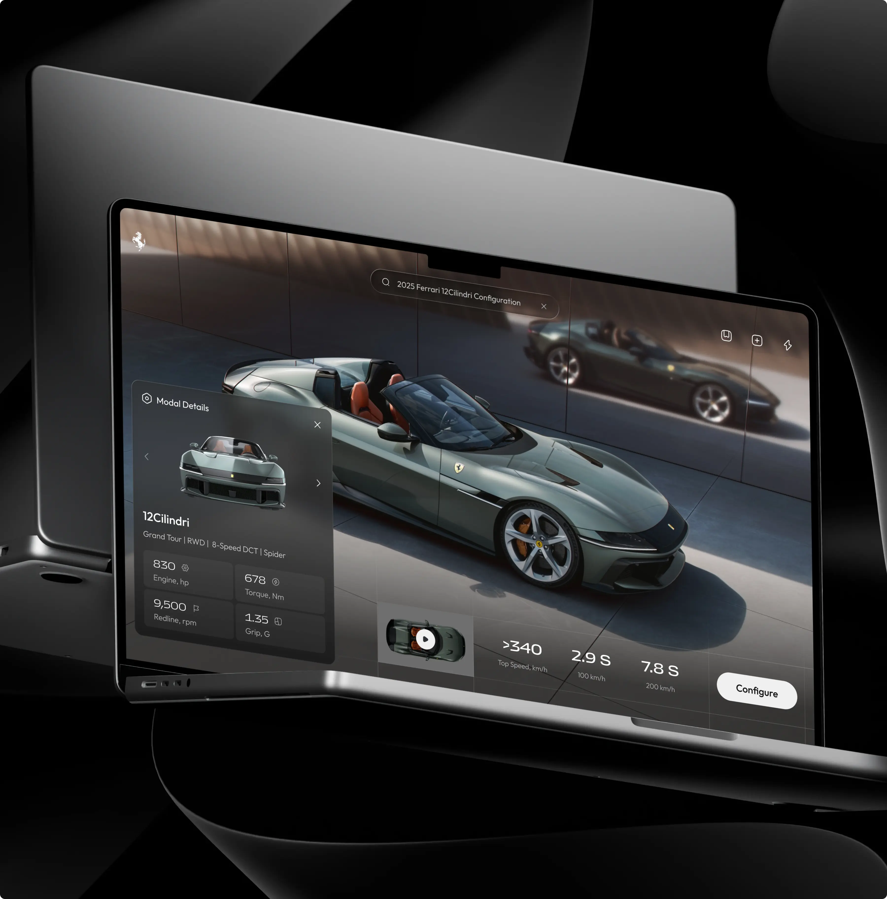
The redesign moves the site away from being something you just click through. Instead, it’s built more like a sequence. You move from one moment to the next, with motion and visuals doing most of the work. There’s less explaining, more showing.
We didn’t want users to feel like they’re navigating a structure. The goal was simpler — make it easy to get pulled in and keep going. So the experience shifts from browsing to exploring. And that small change is what makes it stick.


..svg)