UX ROI: What Bad UX Really Costs, and How to Estimate the Return on Fixing It

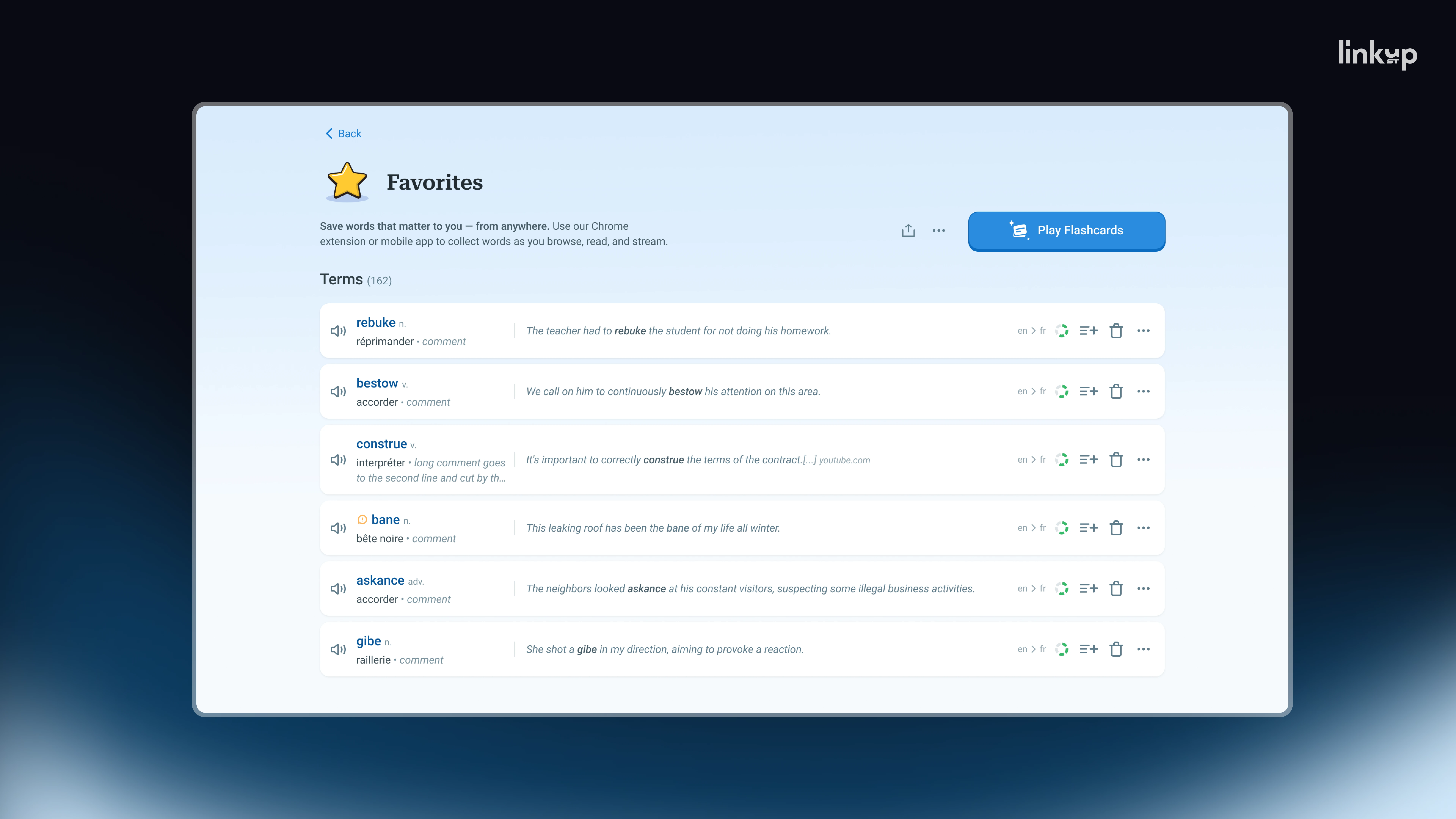
About 10,000 people land on a language-learning platform in a single day, and the company pays nothing for them. A language blogger has shared her own vocabulary list with her Instagram followers. She wasn't paid to post, and the people clicking through already want to learn.
Roughly 100 of them click the button that opens the platform's flashcards. That feature is what keeps users coming back and what converts them to premium. The other 99% leave.
Nothing is broken. The button exists, is styled correctly, and sits where it is supposed to be. This is why UX ROI is so hard for founders to see. A design problem doesn't show up as an error, a bug report, or a line item in the budget. It shows up as a conversion rate the team has quietly come to accept, and the return on fixing it stays invisible until someone puts a number on the loss.
Bad design is rarely about looks. It is about friction: small barriers between a person and the thing they came to do. Each one has a price. Below, we look at what that price was in three real products, which UX metrics reveal it early, and how to estimate the return on removing it.
Why the ROI of UX design is hard to see
Take an online shop with good products and fair prices. To buy anything, you have to create an account, fill in a long form, and wait for a slow page. Many people leave. Nothing about the shop is ugly; it simply makes buying hard.
.webp)
The same pattern runs through digital products:
- a sign-up with so many steps that people never finish creating an account;
- an app that hides its main feature, so new users open it once and never return;
- an error message that says "something went wrong" and nothing else, so the person gives up.
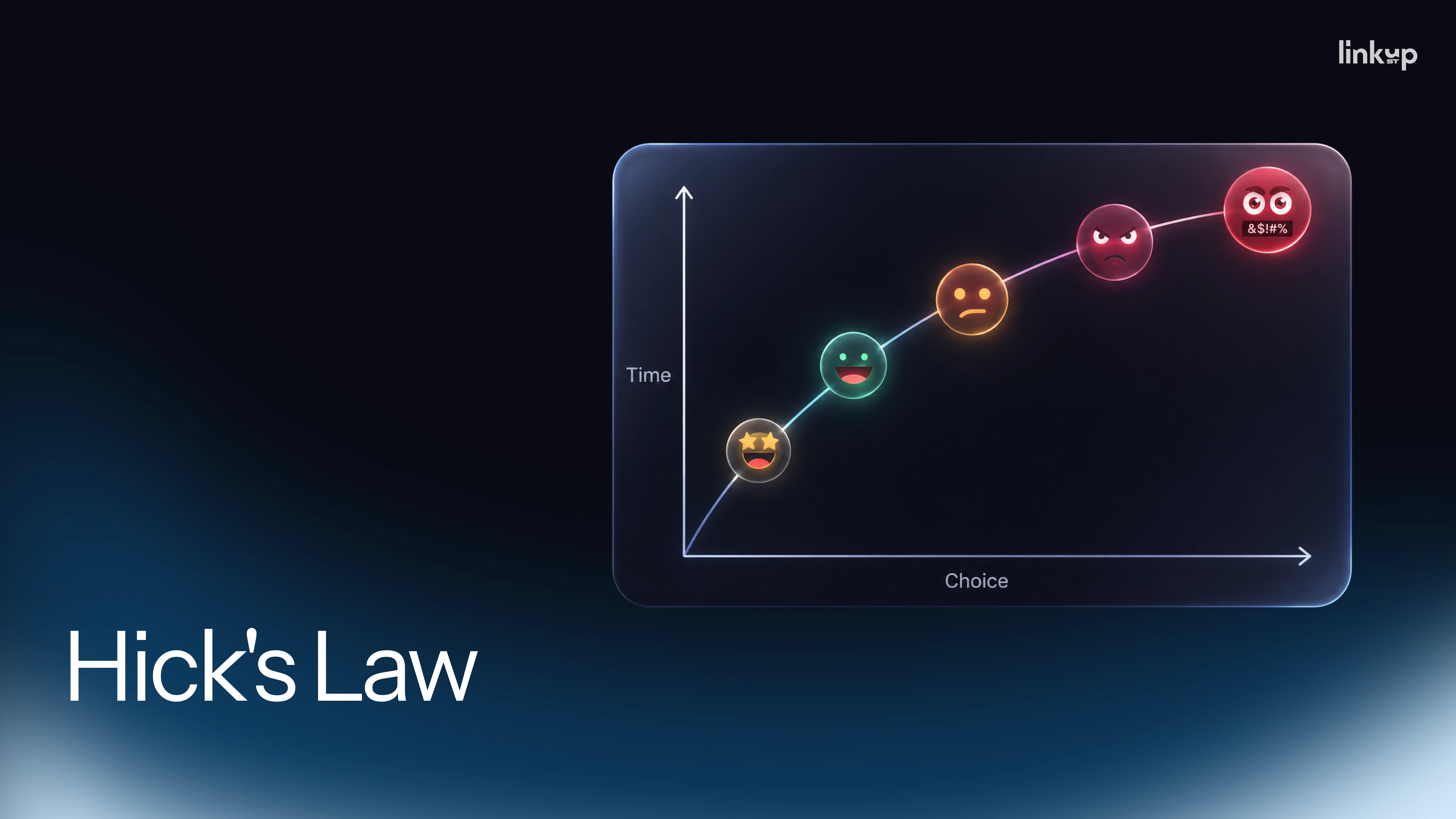
Two principles from cognitive psychology explain why small frictions add up. The first is cognitive load. Think of it as a small battery the brain uses for decisions. Every extra step, every extra choice, and every moment of "what does this mean?" drains it a little, and when it runs low, people take the easiest option, which is to quit. The second is Hick's Law: the more options you show someone, the longer they take to decide and the more likely they are to give up.
Founders underinvest in fixing this because the cost never arrives with a label. As Pavlo Savchenko puts it during the recent webinar : "Bad UX never sends a bill with Bad UX written on it. Instead it hides inside numbers you already watch."
- Fewer people finishing a flow shows up as a lower conversion rate.
- People leaving at a specific step shows up as drop-off.
- The same confused questions every day show up as support cost.
- People who try the product once and never return show up as churn.
These four metrics are where the cost of bad UX hides, and where the return on fixing it appears. The useful question isn't whether your product looks good. It's where your product is hard to use, and what that difficulty costs.
Three UX ROI examples from real products
Sonos: what a redesign costs when it removes what users rely on
The clearest example of negative UX ROI comes from Sonos, which makes speakers that customers control through a phone app. In May 2024, the company rebuilt that app from scratch. The new version was cleaner, but it shipped without features people used every day, including alarms, sleep timers, and basic controls. It was slow, and for some users the speakers stopped responding entirely.
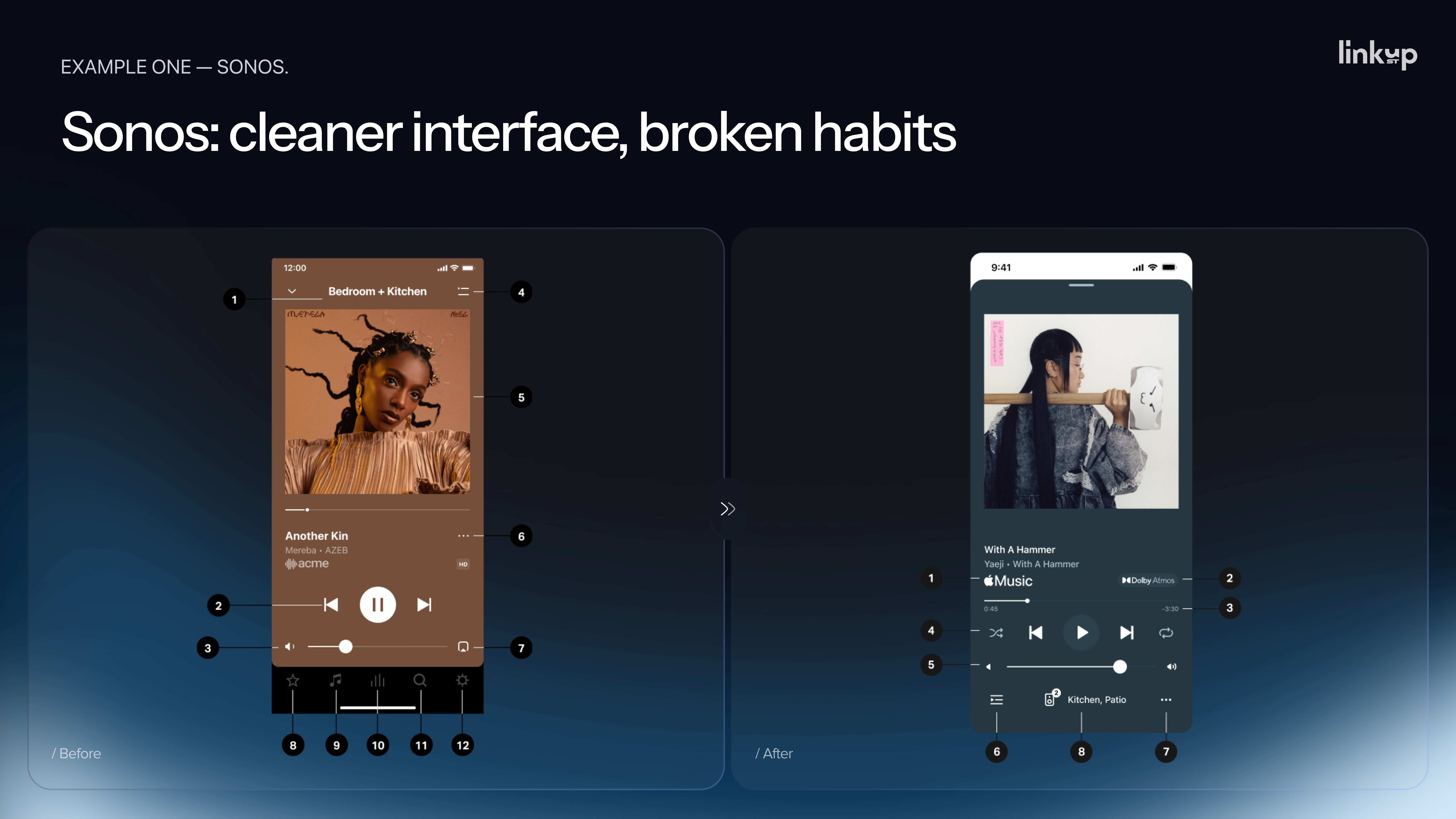
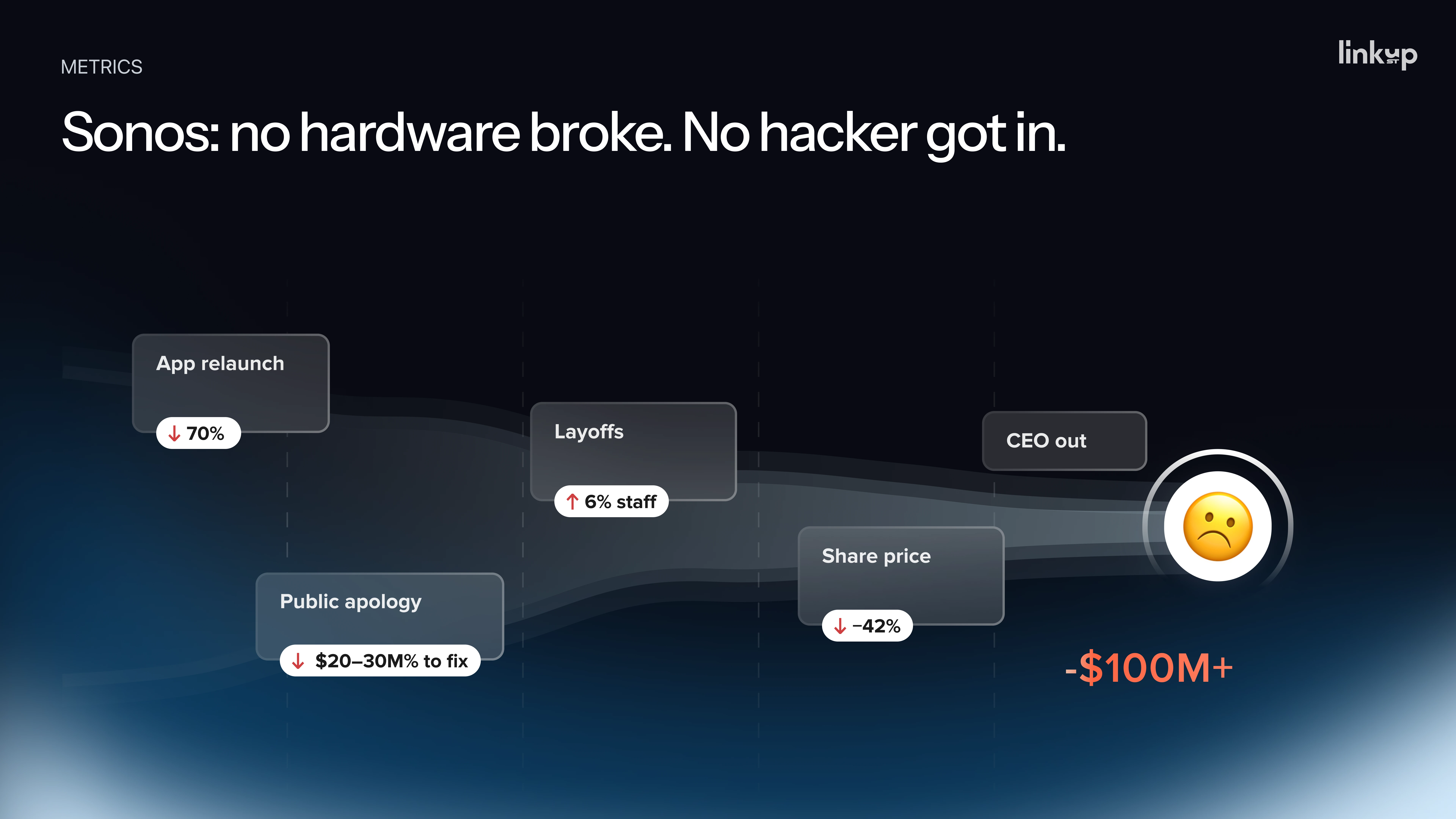
The consequences were severe. The company's CFO estimated that the app problems cut revenue by at least $100 million. Sonos budgeted $20–30 million to fix the app and win customers back, and laid off about 6% of its staff, roughly 100 people. In January 2025, eight months after the launch, CEO Patrick Spence stepped down after eight years in the role. By then, the stock was down about 13% from the day the app launched. No hardware failed and nobody was hacked. The damage came entirely from the experience.
Two principles explain the failure:
- Jakob's Law. People expect your product to work the way it did yesterday. When you remove controls they depend on, the change doesn't feel new. It feels broken.
- The peak-end rule. People judge an experience by its worst moment and how it ends. By moving every customer to the new app at once, Sonos gave its entire customer base the same worst moment on the same day.
The alternative is straightforward: release a major change to a small group first, and give them a way back to the old version. With the same design, the result would likely have been a small bump rather than a nine-figure headline. Rollout strategy is part of UX ROI. It decides how far a design mistake can spread before you catch it.
A language-learning platform: from 1% to 30% feature adoption
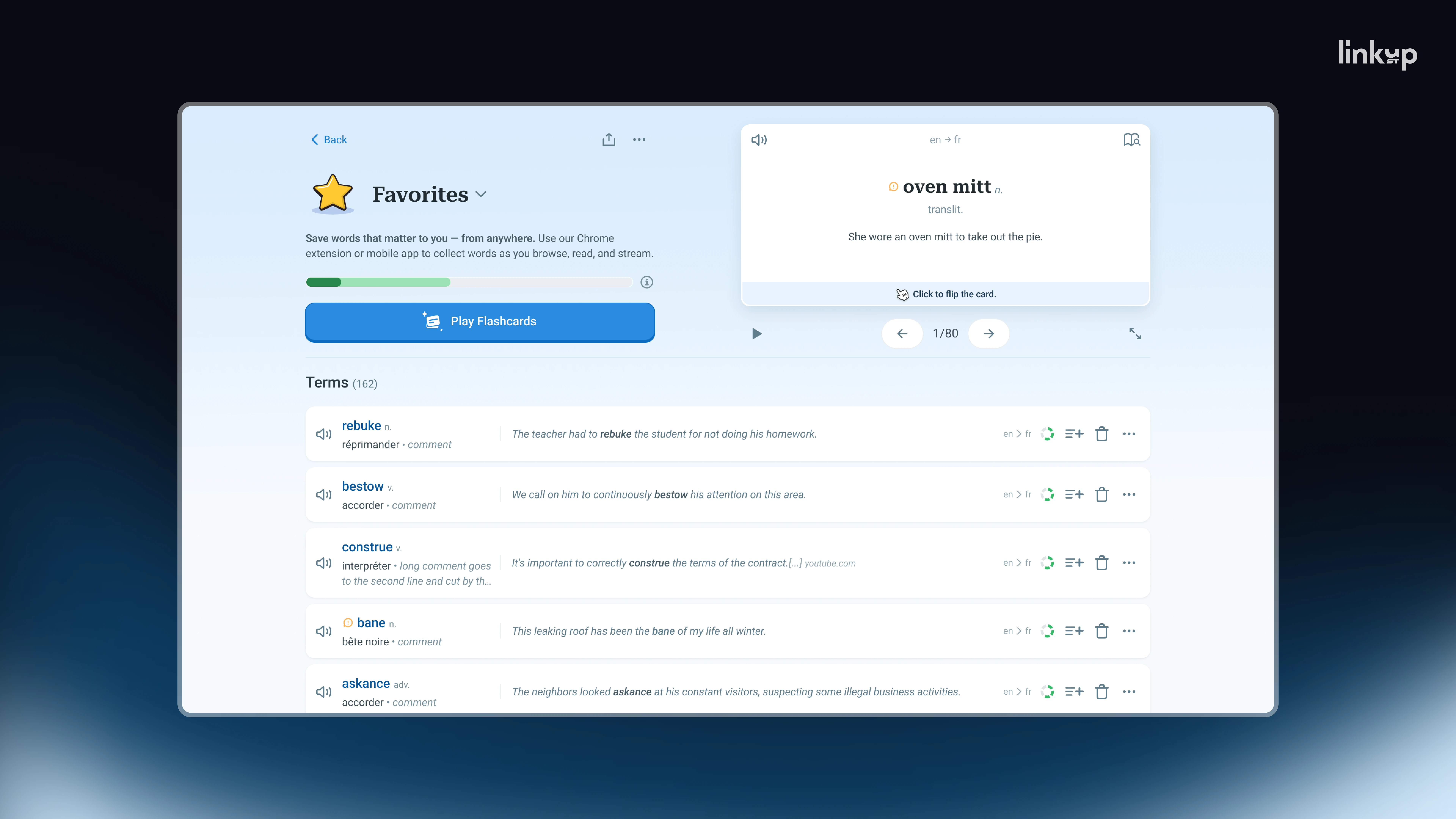
The flashcard button from the opening belongs to a language-learning platform Pavlo works on as a product designer. Analytics and user testing showed two reasons it failed.
The first was expected. People didn't notice the button. It was on the page, but outside their line of sight.
The second mattered more. The button didn't tell users what would happen. The label said "play flashcards," but users didn't know what that looked like or what clicking it would do. People don't click into the unknown, and that is normal behavior, not laziness. "We thought we had a visibility problem. What we actually had was a clarity problem," Pavlo says.
Visibility and clarity need different fixes, so the team didn't simply move the button. They changed the moment a user first meets the feature:
- an interactive flashcard widget in the hero section, so visitors could see and try the feature without reading about it;
- first-session onboarding with interactive tooltips that walked new users through it.
The principle behind both was to stop asking for the click and start showing the payoff.
One month after release, around 100,000 people were using vocabulary lists, and about 30,000 of them reached flashcards. That's roughly 30%, up from 1%: a thirtyfold change, not a 30% improvement. The fix required no new feature, only a clearer first encounter with an existing one, so its cost was small relative to the gain.
The broader lesson applies to any product that lives by conversion. A UX problem rarely looks like a bug. It looks like a number the team has gotten used to. And the most expensive moment isn't when everything breaks. It's when thousands of people finally show up and the product isn't ready for them.
An enterprise platform: onboarding cut from six months to 19 days
The third case shows the same problem at a slower pace. Yaryna worked on the UX redesign of an enterprise platform used by large organizations, where thousands of IT administrators spend hours every day. A decade of engineering had made it highly capable. Every feature existed somewhere, and that "somewhere" was the problem.
New users needed about six months to stop being intimidated by the tool, not to master it. Everyone treated this as normal, until the same sentence started coming up on client calls: a competitor's interface just looks easier. Once friction is visible enough for clients to notice it themselves, it stops being a UX problem and becomes a churn problem.
Nothing in the product was broken. Every button worked, and every decision made over ten years had been logical. The product followed engineering logic, and users were expected to learn to think like the system.
The redesign started with research, not design files: interviews with the administrators who use the system daily, plus the support, sales, and product teams. Forms produced the biggest surprise. The assumption was that users wanted them more compact. In fact, users did two different jobs in them:
- auditing, which needs everything visible at once;
- editing, which needs a compact, focused view.
Making forms smaller would have fixed one job and broken the other. A toggle between the two modes resolved the most persistent daily complaint with a single control. What looks like one problem is often two problems with the same symptom.
The team then rebuilt the logic, not just the screens: clearer access levels, navigation built around a clear spatial map, and notifications that don't interrupt work. The redesign went out while the platform stayed live, with no downtime for its thousands of daily users.
Onboarding time fell from six months to 19 days. The return is easiest to see from the other side: those six months had been half a year of every new hire's salary spent fighting a tool, while clients politely looked for alternatives.
Four UX metrics that reveal ROI before revenue moves
In all three cases, the warning signs appeared before the money moved. The data wasn't missing; nobody was looking at the signals together. Most teams already have three of these four.
1. Rage clicks. A rage click is pressing the same button repeatedly because nothing happens, like jabbing an elevator button. Analytics and session-replay tools detect them and point to the exact element that's failing. Frustration is data, and it deserves the same attention as any other metric.
2. Session replays. A funnel shows where people leave, but not why. A replay is a recording of a real user's screen. Ten replays of your worst-performing step will teach you more than a month of charts.
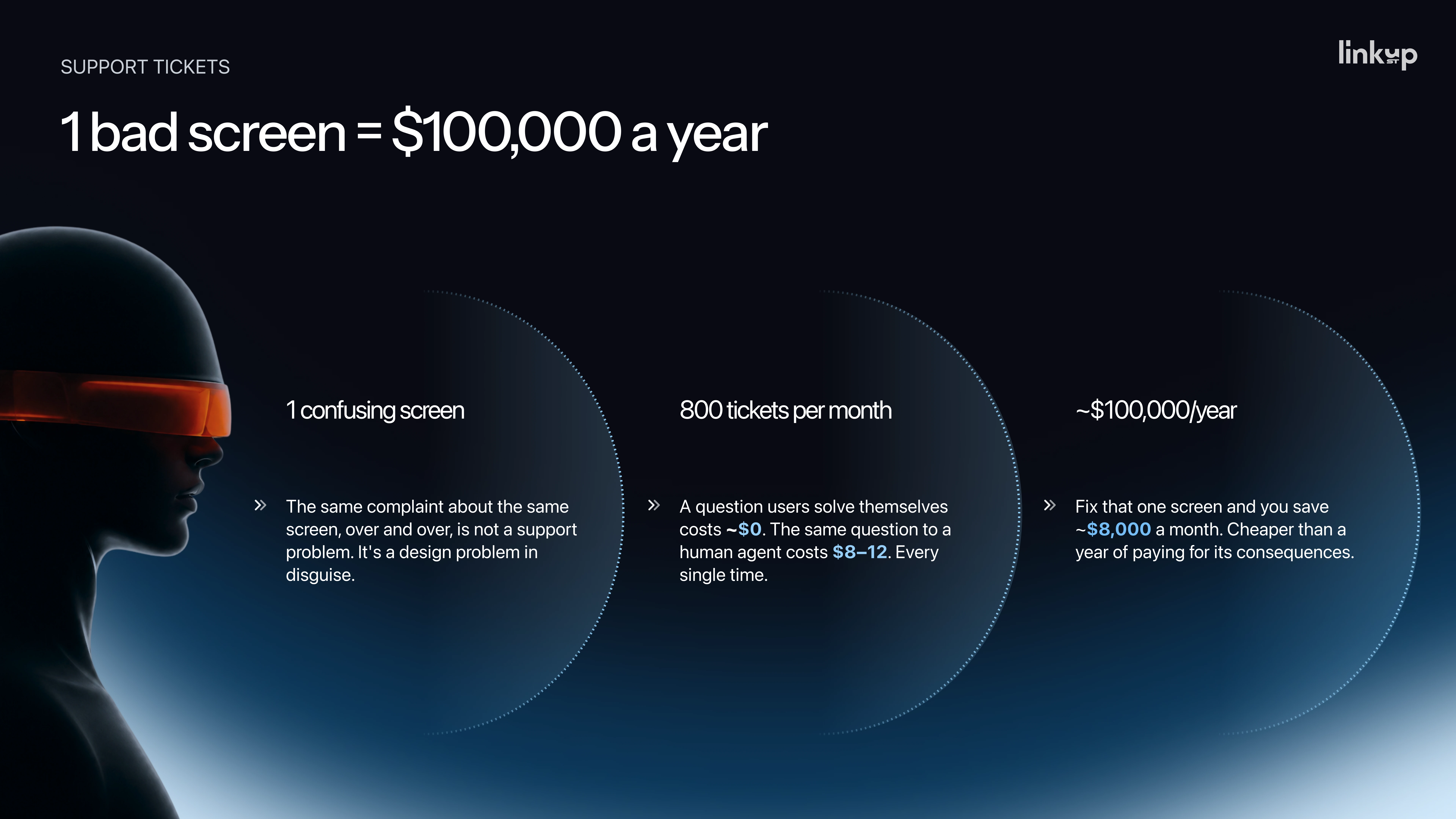
3. Repeated support tickets. The same complaint about the same screen, over and over, isn't a support problem. It's a design problem showing up in support.
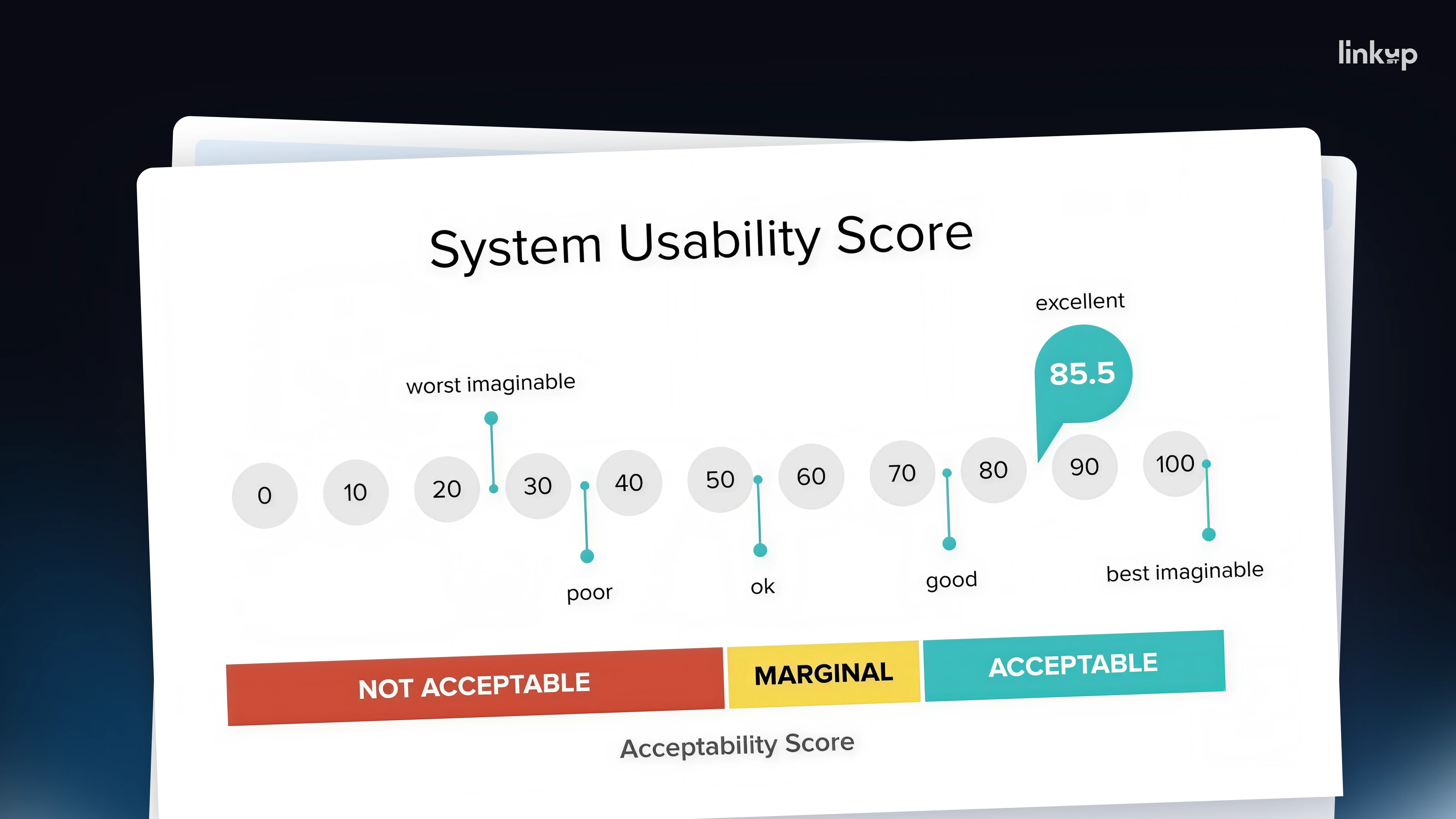
4. The System Usability Scale (SUS). This standard ten-question survey produces a score out of 100. The benchmark is 68: across roughly 500 studies compiled by MeasuringU, that is the average score, so anything below it is below average. Run it with every release and you get a trend instead of a debate. It won't give you a dollar figure, but it tells you which part of the product to fix first, before sales drop.
None of this requires a research lab. It takes someone willing to look at all four signals together.
.png)
How to estimate the ROI of fixing a UX problem
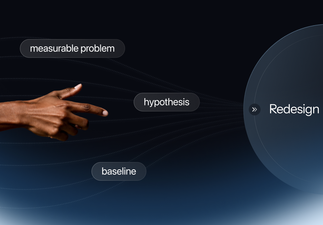
Pricing a UX problem comes down to two questions: how many people does it hit, and what does one lost person cost? Multiply the answers and you have a monthly price for the problem, which is also the upper bound of what fixing it can return.
Here is how that works for a hypothetical checkout button:
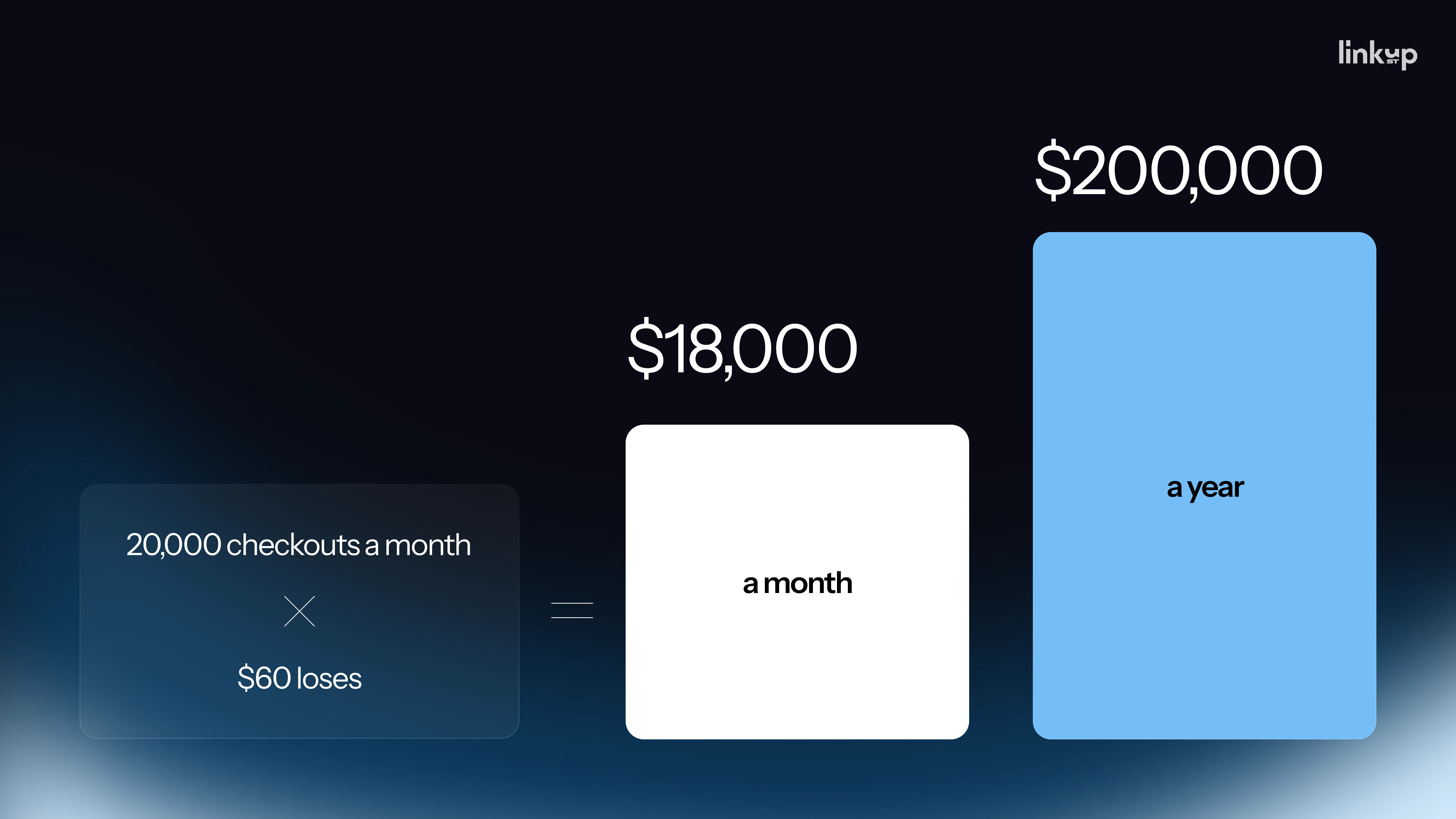
- A store has 20,000 checkouts a month with an average order of $60.
- 3% of checkout visitors rage-click the Pay button, which is 600 people.
- Half of them leave, which is 300 lost orders.
- 300 × $60 = about $18,000 a month, or over $200,000 a year, lost to one button.
The same logic applies to costs. A question users solve themselves costs nothing. The same question handled by a human agent costs roughly $8–12. A screen that generates 800 tickets a month therefore costs about $8,000 a month, close to $100,000 a year, and fixing the screen removes most of that.
To turn the price of a problem into ROI, compare it with the cost of the fix. This is where cheap diagnostics pay off. Session replays, SUS surveys, and watching a few people use the product cost almost nothing, and in the flashcard case the fix was a clearer first encounter with an existing feature rather than new development. In our estimate, one afternoon spent reviewing these signals together can protect a few hundred thousand dollars a year.
Two cautions keep the estimate honest. First, it measures what the problem costs, not what you'll recover: some of those 300 people would have left anyway. Treat the figure as a ceiling and use it to rank problems, not to promise a result. Second, make sure the problem really is UX.
Bad UX or no demand? Check before you calculate
The obvious objection is that low conversion may simply mean nobody wants the product. The way to tell is to look at where people disappear. If they never show up, that's a product or marketing question. If they show up and then stop at a long form, a button that doesn't respond, or an unexplained error, that's UX. Those people already wanted what you offered, and something got in their way.
Drop-off is the metric that exposes UX problems first. Conversion tells you fewer people finished, churn tells you they didn't return, and support costs tell you they were confused. Only drop-off shows the exact step where people leave. Find the worst step and watch five recordings of it. That turns a vague worry about the numbers into specific people quitting at a specific place, which is the only kind of problem you can price.
Twenty problems and one team: prioritize by price
Watching recordings creates a new problem: a long list of issues. Two complementary approaches help sort it.
The first is to rank by price, using the calculation above. A dead button in checkout outranks a clunky settings page because it sits exactly where people pay you. As Yaryna puts it: "You're not fixing 20 things, you're just fixing the one with the biggest number." Fix the most expensive issue this week and the next one next week.
The second is to split the list into global and local issues. Global issues block users early in their journey. Local issues sit inside specific modules further along. Polishing a deep module has little return if most users never get past the entry point. Clear the big blockers first, then work through the local fixes once the overall path is sound.
If the list is long and the team is small, an outside UX audit can do this ranking for you. One inexpensive habit helps either way. Founders and designers know their own product too well to see its friction. What's obvious to the team, like the flashcard button, may not be obvious to anyone else. Showing the product to friends or family and watching them try it is a cheap, fast first round of testing before investing in formal interviews and recorded sessions.
Where the return on good UX shows up
Good UX for business is a source of return, not a cost of being thorough. The figures below are rules of thumb from our design practice, not guarantees:
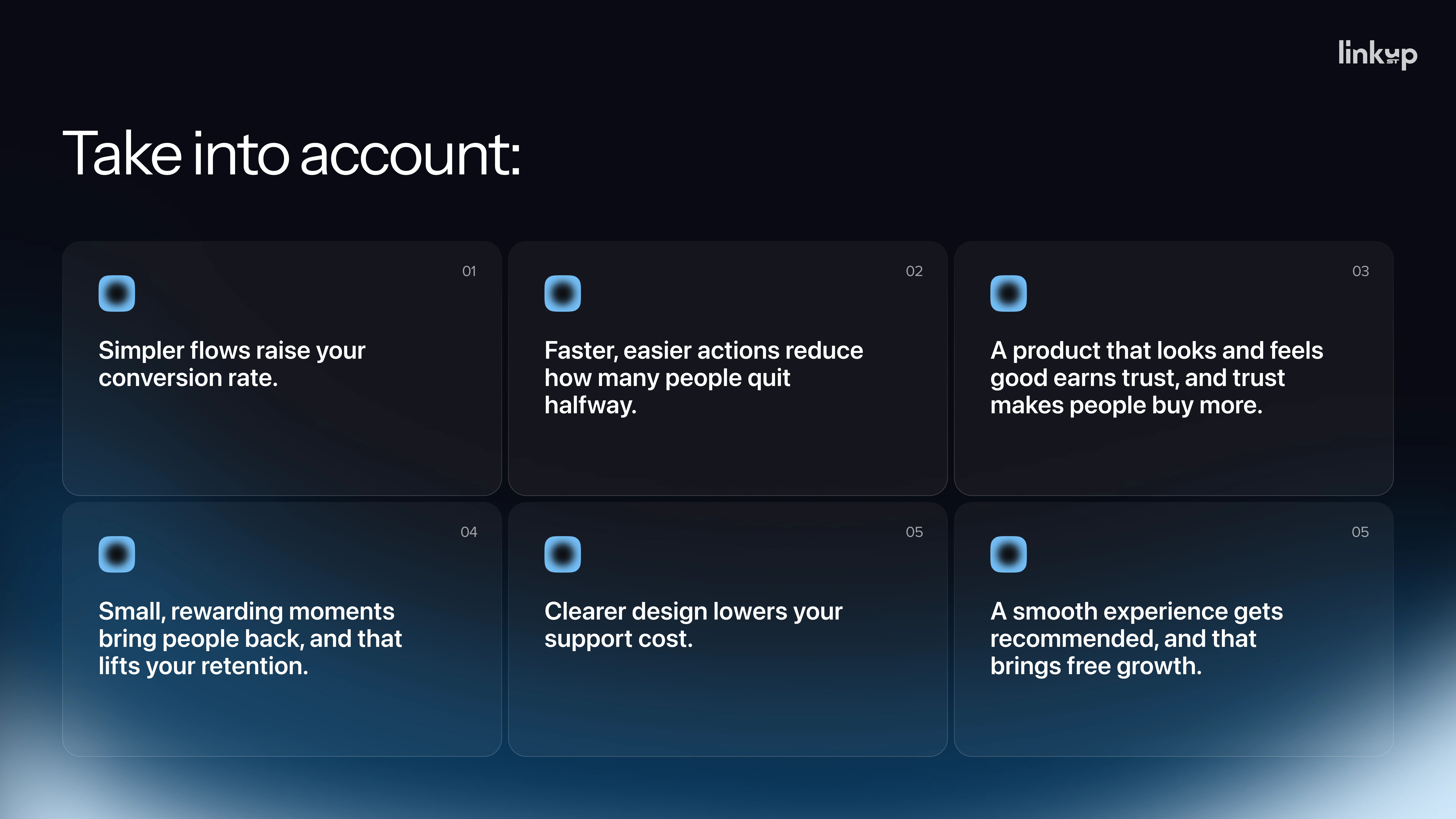
- Simpler flows raise conversion. Each unnecessary form field removed is typically worth a few percentage points of conversion, and a cleaner flow can lift it by double digits. Those gains are almost pure profit, because you've already paid to acquire the traffic.
- Faster, easier actions reduce abandonment. Making the main action fast and obvious, with larger buttons that are easier to tap, typically wins back a mid-single-digit share of buyers who used to drop out.
- Polish builds trust. Under the aesthetic-usability effect, people perceive smooth-feeling products as working better and forgive small flaws. That trust lifts average order size and moves more browsers to buy.
- Small wins drive retention. Most profit comes from the second, third, and tenth visits, not the first. Ending each session on a small success applies the peak-end rule in your favor, and small retention gains compound over a year.
- Clarity cuts support costs. Every question the interface answers is a ticket nobody has to pay to handle.
- Good experiences spread. A referral is a sale with zero acquisition cost, but it only happens when the product feels good to use.
Bad UX isn't ugly; it's expensive. Good UX isn't decoration; it pays you back.
Start with one flow this week
You can start in about an hour. Pick one flow, find the number attached to it, and watch five users go through it. Then price what you find, before your competitors' easier interface does it for you.
Want to hear the authors walk through these cases? Watch the full discussion.
.avif)